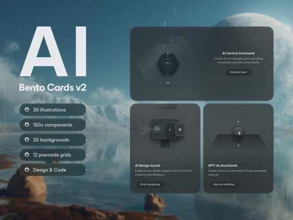
Bento Cards: AI
Sponsored
We curate topical collections around design to inspire you in the design process.
This constantly-updated list featuring what find on the always-fresh Muzli inventory.
Last update: 8/21/2024

Sponsored
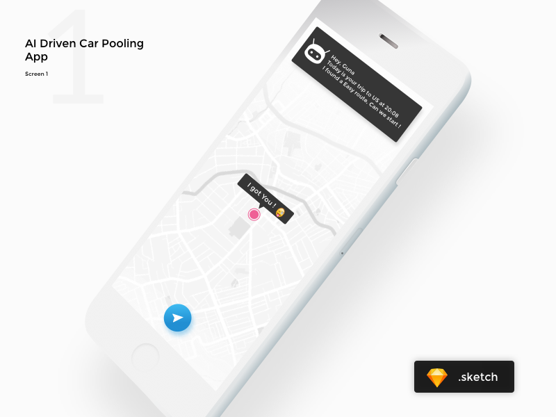
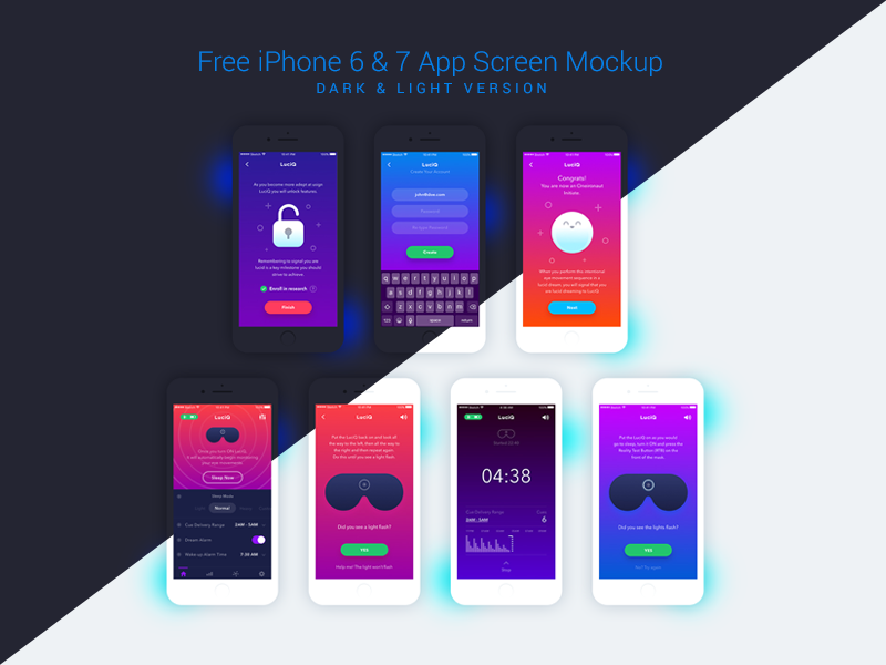
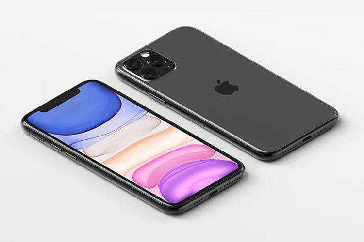
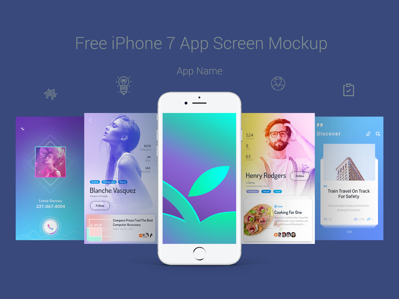
These iPhone mockup PSD templates for Photoshop are perfect for showcasing user interface or user experience of your mobile app or responsive website. The post 20+ Mockup PSD Templates Featuring the iPhone for 2021 appeared first on Speckyboy Design Magazine.

When you need to showcase an app design, there’s no better way to do it than with an iPhone mockup. Not only can you use an iPhone mockup to showcase... The post 25 Free iPhone Mockup Photoshop PSD Templates appeared first on Speckyboy Design Magazine.
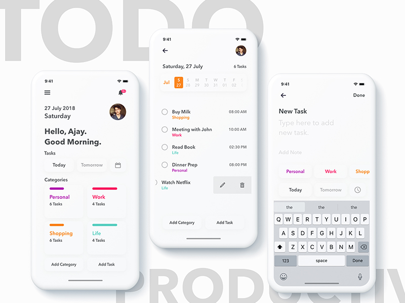
Clean and Simple To-Do App Mockup on iPhone X. #Day5 #DailyUI
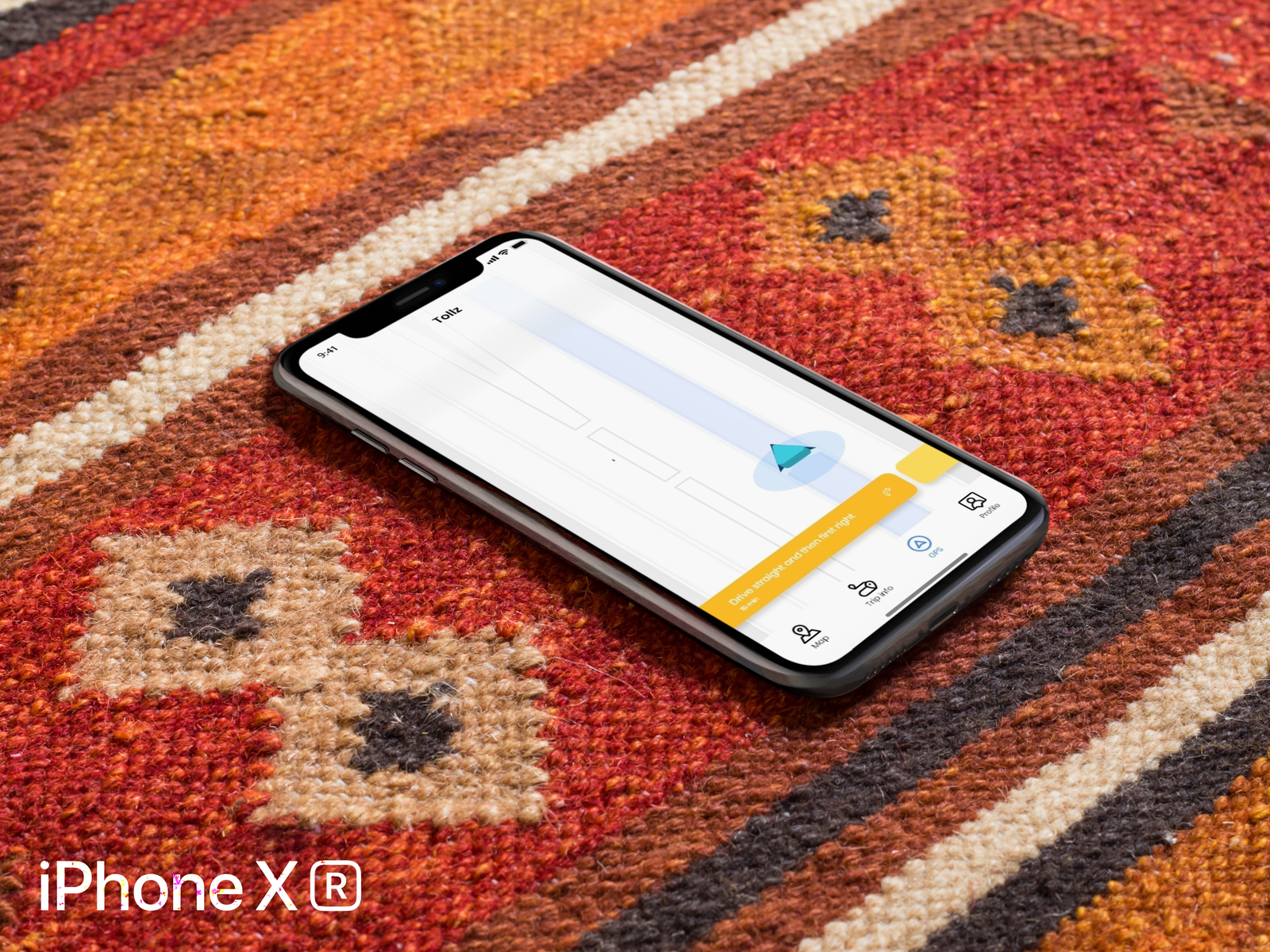
Folks ! Iphone XR mockup - GPS Navigation Route screen for Tollz app, Hope you like it and feel free to comment on it! Thanks!
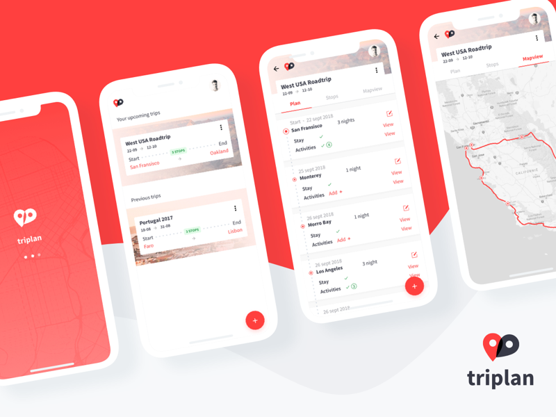
I've been planning a road trip through west USA. Couldn't find a nice planner for it anywhere, decided to try my own hand at it ;) This app should make it easy for anyone to plan a roadtrip. Would love for it to be real! Thankyou @[875326:viggoz] for this beautiful iPhone X mockup!
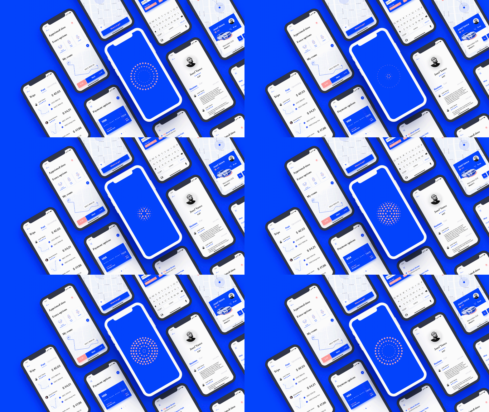
Hi mates! Some time ago I worked on a taxi application and was inspired to make my own one. I made some research and interviewed a target audience to be able to create a useful and comfortable product that corresponds to all user's needs. Advice and opinions are welcome :) Tags: taxi map ui ux app application design wireframe mockup minimal clean light white blue flat mobile ios iPhone android optimization user interface experience interactive layout navigation search profile icon illustration animation
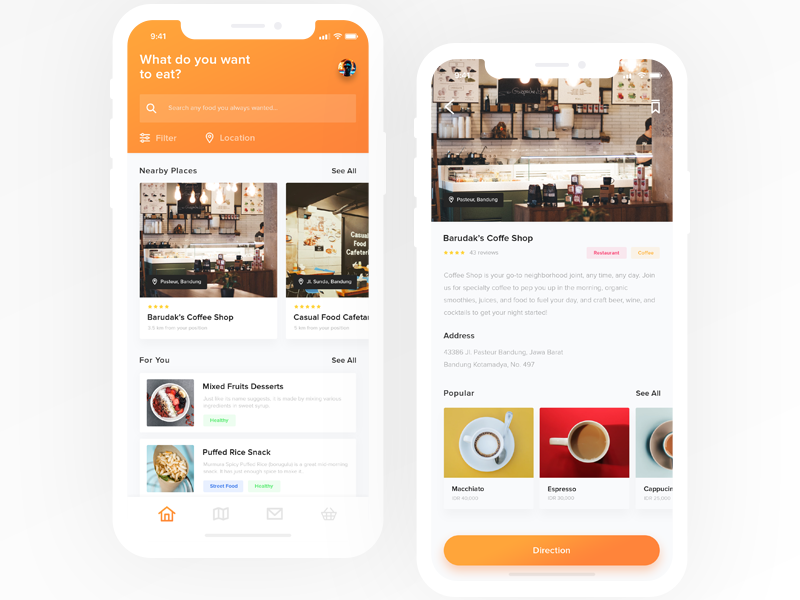
Hello there! This is an app design for people out there looking for food in their nearby area, as in this example it's located in area around Bandung. This is just an exploration and testing out iPhone X Mockups! Mockup by @[346285:Alexander Litvinenko] --------------------- I'd be happy to hear feedback from you! :) Don't forget to press 'L' if you like it. Follow me if you like my work! More to come.
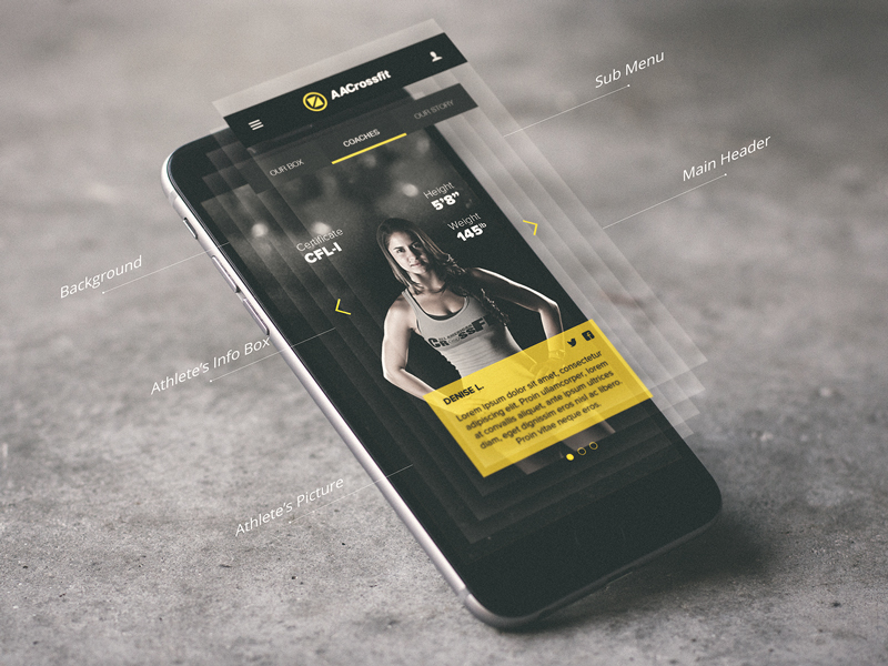
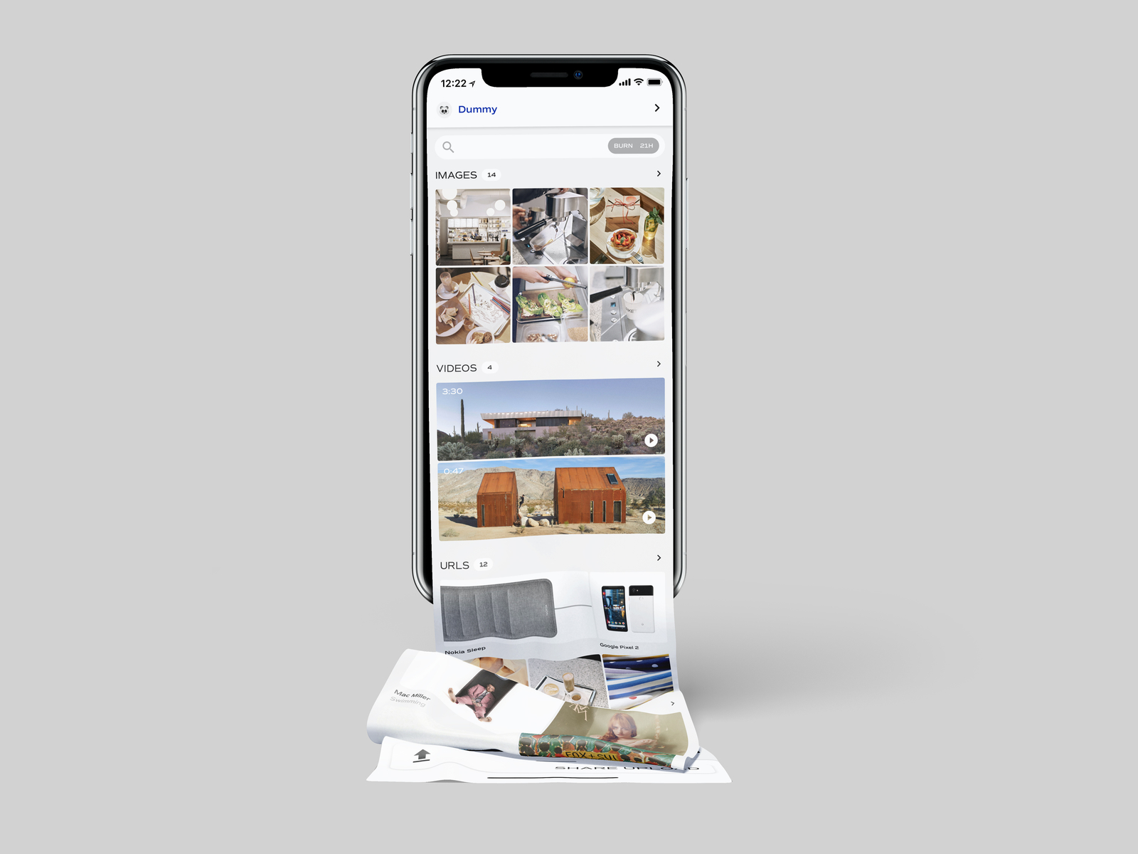
🕷It's a screenshot of a shared files page on a messenger app design. 😃Download free iPhone X Long Scroll mockup from @[1267164:LSTORE].
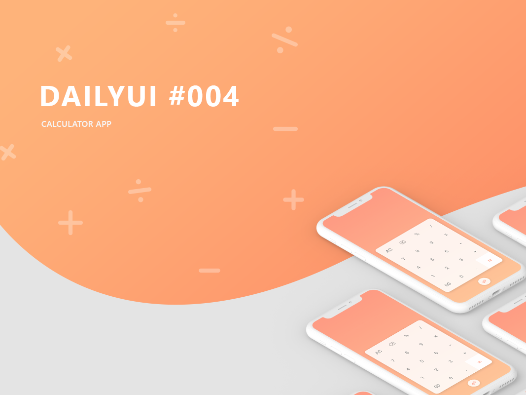
Hello, dribbblers. This is the 4th entry in my daily UI challenge. Please show some love. It's a calculator app for mobile platforms. full project : https://www.behance.net/gallery/73219365/Daily-UI-004 mockup credits : https://www.behance.net/gallery/66772361/Minimal-Clay-iPhone-X-Presentation-Mockup-Set


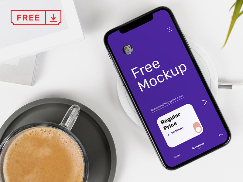
We are pleased to share with you this realistic iPhone X on Desk Mockup which you can use freely to showcase your Mobile App project. Mockup available for ---> DOWNLOAD Follow us: Behance | Instagram | Twitter | Facebook
Mockup templates can make a designer’s job easier by allowing him to create a quick and professional presentation of his work. However, sometimes it is difficult to find the right mockup template — especially when you’re under pressure for time.To save you the trouble of having to hunt for high-quality, free design resources on your own, we’ve compiled a list of 23+ free and great websites that offer free mockups.600+ Free Design resourcesThe web’s biggest free collections of Design Resources. Free stock images, illustrations, you just name it. Everything for free.Visit — Free Design ResourcesWhat are mockups?A mockup is a design template that shows how the final version of an application or web page might look. Although it can include some working elements, such as text boxes and links to other pages, most mockups are basic versions without advanced functionality and may even use dummy data instead of real informationMckupsFree photorealistic mockupsVisit — https://mckups.com/SmartmockupsSmartmockups enables you to create stunning high-resolution mockups right inside your browser within one interface across multiple devices.Visit — https://smartmockups.com/PSDrepoLoads of free PSD mockups that are easy to customize and for presenting your work.Visit — https://psdrepo.com/tag/free-psd-mockups/PixelbuddhaThese mockups can become a great start for your work presentation. They are designed using smart objects, which makes it so easy to use them.Visit — https://pixelbuddha.net/mockupsMockuuupsDrag-and-drop tool for creating beautiful app previews or any marketing materials. Easily insert your screenshot into device mockups for free.Visit — https://mockuuups.studio/Mockupmark — Free MockupsMockup Mark is an online T-shirt & apparel mockup generator. Find the perfect T-shirt, hoodie or other apparel mockups and create engaging content for your print-on-demand store and social media. Get started with one of our free T-shirt mockups today!Visit — https://mockupmark.com/create/freeAnthonboydFree Mockups by Anthony Boyd Graphics. Easily Edit Smart Objects in Photoshop. Free for personal and commercial use.Visit — https://www.anthonyboyd.graphics/mockups/PSDMockupsFree PSD Mockups Smart Object and Templates to create Magazines, Books, Stationery, Clothing, Mobile, Packaging, Business Cards, Banners, Billboards, Flags, Advertising, iPad, MacBook, Bottles, Wine, Beer and more.Visit — https://www.psdmockups.com/Freepik — PSD MockupsFind & Download the most popular Mockup PSD on Freepik ✓ Free for commercial use ✓ High Quality Images ✓ Made for Creative ProjectsVisit — https://www.freepik.com/psd/mockupMrMockupHigh Quality PSD Mockups and Graphic Design Freebies to Showcase Your Work Like a Pro! We build premium and free Mockup templates for profesional designers.Visit — https://mrmockup.com/Layers DesignLayers is a curated library of design resources. Seeking to make the complex simple & beautiful.Visit — https://layers.design/collections/mockupsShotsnappCreate beautiful device mockup image from the screenshots or design of your mobile app and websitesVisit — https://shotsnapp.com/MockupsJarCreate mockups for your websites, mobile apps and more in 3 easy steps. The easy to use and friendly 🦄 mockup generator! No Photoshop or plugins needed!Visit — https://mockupsjar.com/MockuptreeDownload Free Mockup PSD Templates for: T-Shirt, Logo, Poster, Brochure, Magazine, Book, iPhone, Business Card, Packaging, Bag, Box, Stationery, Apparel, Device, Mobile, iPad, MacBook, Cosmetic, Beer, Bottle, Wine, Billboard, Signs and more. All free mockups consist Smart Object for easy edit.Visit — https://mockuptree.com/Artboard StudioDesign, animate, collaborate and present your projects with an extensive library of assets and templates right in the browser.Visit — https://artboard.studio/Premium PixelsPremium Pixels is a collection of free design resources created and curated by UK based Web Designer Orman Clark. Hopefully you’ll learn something new but hey, just saving yourself some time is awesome enough, right?Visit — https://www.premiumpixels.com/Is graphics — Free MockupsHuge collection of free mockups, patterns, illustrations, scene creators, DIY scenes, for Photoshop, Sketch, and FigmaVisit — https://www.ls.graphics/free-mockupsMockup WorldTons of free and legal, fully layered, easily customizable photo realistic PSD mockups: Ready to use in your projects, app showcases and presentations!Visit — https://www.mockupworld.co/MockuperMockuper, the free mockups generator to create custom images to show your awesome worksVisit — https://mockuper.net/Mockerie“Mockup Your Website Or AppInteractive, Instant and on FREE Stock Photography”Visit — https://mockerie.io/ScreenpeekPaste URL, Create Mockup. Screenpeek captures any website within a high quality mockup in seconds.Visit — https://screenpeek.io/ScreelyInstantly turn your screenshot into a beautiful website mockup. Customize the browser mockup window, background and much moreVisit — https://www.screely.com/House Of MockupsDownload the best quality free and premium mockups for packaging, posters and billboards, phones, UI kits, instagram advertising templates and brochures to beautifully present your design projectsVisit — https://houseofmockups.com/There are many great places online to find free mockup templates for designers, and we’ve collected them all in one place so that you don’t have to search around.Read more:50+ Free icons resources for designers in 202323+ Free mockup resources for designers in 2023 was originally published in Muzli - Design Inspiration on Medium, where people are continuing the conversation by highlighting and responding to this story.
via Muzli design inspirationThe best design inspiration — expertly curated for you.Muzli is a new-tab Chrome extension that instantly delivers relevant design stories and inspiration. Learn moreWebsitesDanilo De Marco — Visual And Type Designer Desginer.The Calm Strong Elder | B&O See Yourself In Sound.SLAPS — An Independent Creative Company.Dark Dog — Energy Drink.Design ResourcesDante — Agency Website TemplateHave a powerful agency that can help brands see incredible results…but don’t have a website to back up your talent? Get the Dante template. Make sure no prospect ever bounces off your site without booking a call..Finanzo — SaaS Website TemplateFinanzo — Saas Website Template is a modern template for creating a Saas website. Minimalistic Saas Templates for your needs and dreams. This Webflow template is clean and easily customizable..Tracker — SaaS Website TemplateTracker is a clean and modern CMS landing page template for SaaS businesses that want a beautiful and unique website. With 6 unique page templates, 2 CMS collections and advanced animations, this template has everything you need..DotCoin — Crypto Market Dashboard UI KITDotcoin is a Premium and High-Quality Crypto Market Dashboard UI Kit With 30+ High-Quality Screens And Easy To Use In Figma Crafted With Love And UX Friendly Design..iPhone 14 Pro Mockup — 70 High Quality PSD MockupsGet your hands on our high-quality iPhone 14 Pro mockup collection, featuring sleek designs in Silver, Deep Purple, Space Black, Gold + Space Gray. Elevate your presentations and showcase your app or design with style and precision..Cat Pose 3D Icon SetElevate your mobile app, UI/UX, and web design projects with the Cat Pose 3D Icon Set, adding a unique and eye-catching element to your designs..Product SpotlightSVG Hub | Custom-color elements ready to paste into your projectA library of over 70 custom-color elements ready to paste into your project..Playground AICreate and Edit Images like a pro without being one..LiveSurfaceGet real in real time. See your designs in the real world, with real ink, lighting and textures, while you work..FigGPTWrite copy with AI in Figma & FigJam!Design inspirationHex AI Website by Halo UI/UXINSUMMMEE by Andrii PanchykSalesForce — Promotion Analysis Mobile App by RonDesignLabMedical Consulting Landing Page by Levi WilsonEaster Bunny by Folio Illustration AgencySkater by Razvan VezeteuNo Transmission by Manuel Cetinas n a c k s by Yana VoronovskayaGASP Brand Identity and Packaging by Elina MalkhasyanPorter & Think Packaging for Coffee Supreme by Porter PackagingWeekly Designers Update #408 was originally published in Muzli - Design Inspiration on Medium, where people are continuing the conversation by highlighting and responding to this story.
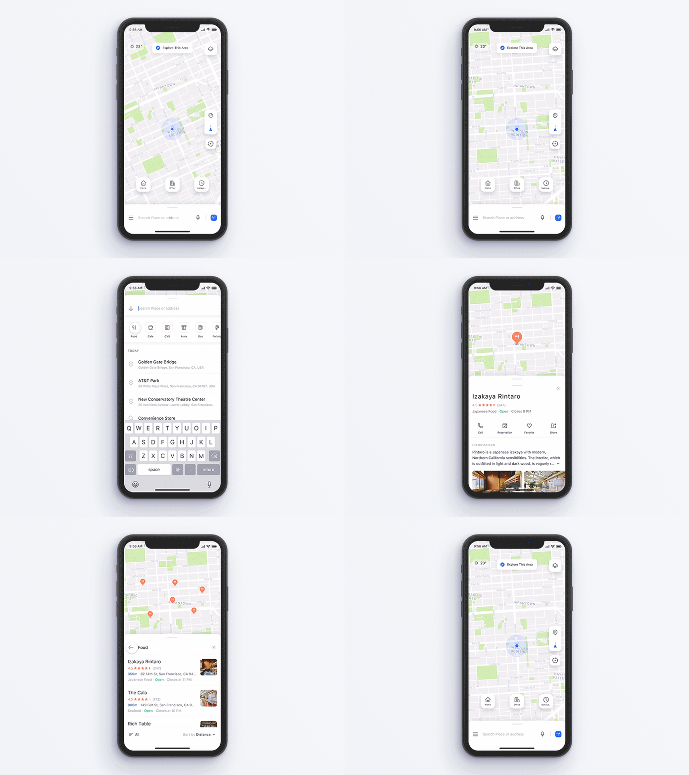
Hi All, For a long time I have been thinking about the ease of use of the Maps app. And I came up new prototype of maps app concept for iPhone X. iPhone X mockup is here. Live demo made @ProtoPie — https://share.protopie.io/igFQenkDfsb (Chrome browsers work better on the desktop.) Follow me on Dribbble! Check @2x for better view.
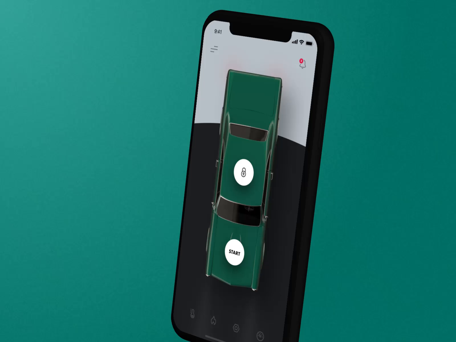
Hi guys, I had a free Saturday so I experimented a little bit and created this app. It was made just for fun of course. This kind of UX would be pain. But I wanted to try work with 3D model and stuff :) You can download this great 3D mockup made by Majo Puterka here Thanks!
via Muzli design inspirationLooking for more daily inspiration?Download Muzli extension — your go-to source for design inspiration!Web design inspirationDiesel Metamorph.Cresci’s.HiQ Brand.Breakthrough Energy | The State Of The Transition Report 2023.Bronitex.Design ResourcesGood Vibe Stickers 3D Icon SetElevate your mobile app, UI/UX, and web design projects with the Good Vibe Stickers 3D Icon Set, adding a unique and eye-catching element to your designs..iPhone 15 Pro — Animated mockupsBring life to designs with an iPhone 15 Pro mockup tailored for After Effects.Voltflow — Agency Website TemplateIntroducing Voltflow, Webflow Agency Template designed for digital agencies. Its polished aesthetics, immersive interactive features, and stunning portfolio display are your secret weapons to mesmerize your site visitors and turn them into clients..Larsen — Agency Website TemplateLarsen is a minimalist and stylish template that enhances presentations of work, for both designers and other creative professionals. Its unique and contemporary design makes it ideal for standing out among other professionals..FORYOU — Agency TemplateFORYOU is a conversion-focused Framer template made for TikTok or Short Form Content agencies. It gives you the ability to showcase your work and results, your services and case studies, and makes it easy for users to book a call directly with you through Calendly..Product SpotlightSVGFlowWith SvgFlow you can transform your icons by changing colors, size, and stroke width on the fly..Boardmix — Online Collaborative WhiteboardBoardmix is an online workspace for teams to gather inspiration, brainstorm, discuss, and create together. Now with AI.Endless ToolsDiscover the endless possibilities with our advanced design tools and boost your creativity to new heights..Phosphor IconsPhosphor is a flexible icon family for interfaces, diagrams, presentations — whatever, really.Design inspirationSisense — Analytics and Business Intelligence Platform by Jack R. for RonDesignLab ⭐️MeetHub — Meeting Schedule Dashboard Concept by Vektora UIUX for VektoraFile Manager Mobile App Exploration by Bogdan Falin for QClayTask Manager Mobile IOS App by Bogdan Falin for QClay🌹 🌵 by Muhammed SajidInsectUMS by Sebastian Arteaga , Sergio Garzón, UMS CREW and Creto UMSSummer Collection — Kappa by Andrew ArcherCadin de Minas | Visual Identity by Lucas MouraArômelle | Brand Identity by David OrtizWeekly Designers Update #428 was originally published in Muzli - Design Inspiration on Medium, where people are continuing the conversation by highlighting and responding to this story.
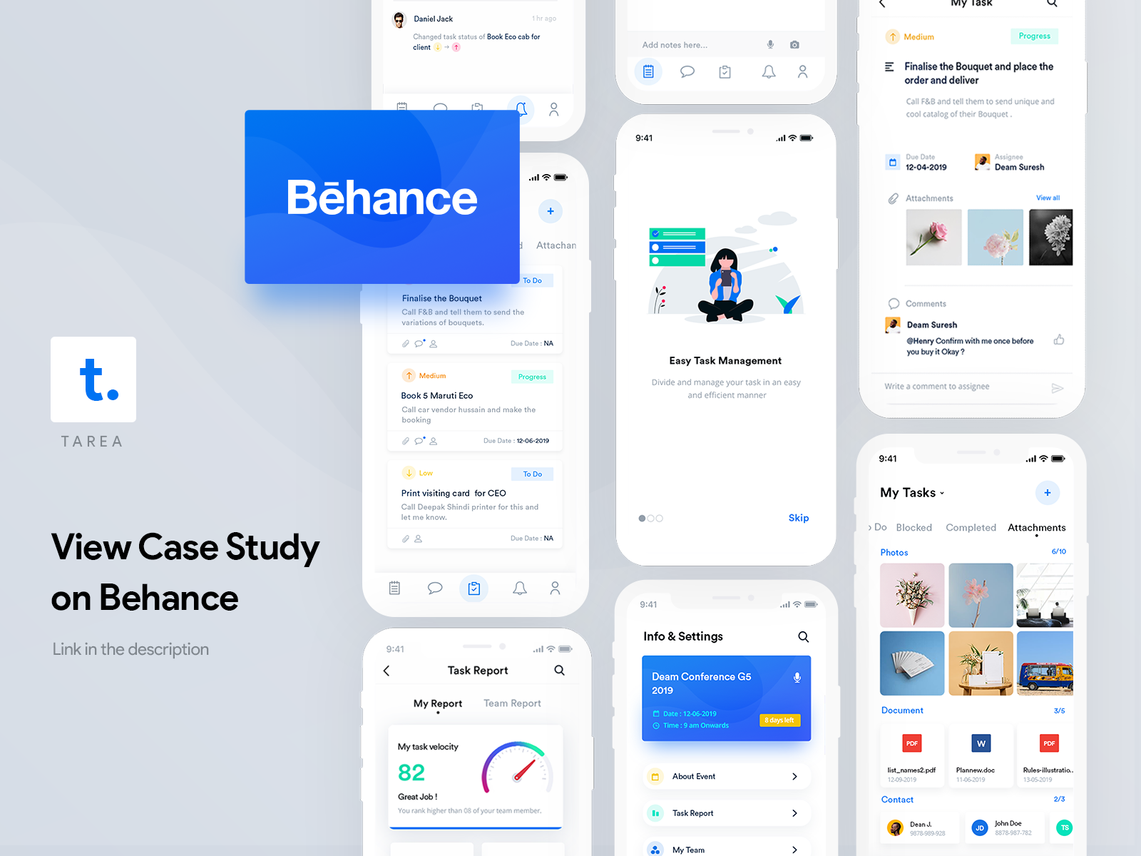
Case Studies Inspiration: A Roundup by aida pacheva, Henry Kunjumon and more AoiroStudioJul 12, 2019 A new Pure Design Inspiration is up! One burst of inspiration roundup to kick it off for the Weekend? Why not! For this week, I decided to pull together a collection of 'case studies' inspiration. Mainly the idea came after publishing my own case study and decided to go for a surf on hand-picked shots from Dribbble. You should also definitely the last shot I included by Lu Yu about 'How to write case studies for your portfolio', an interesting article to read. In this collection we are featuring the work from aida pacheva, Henry Kunjumon, Piotr Kaźmierczak, Paweł Durczok and more. More Links For more, check out Dribbble via Dribbble Design by aida pacheva Design by Henry Kunjumon Design by Francois Hoang Design by Piotr Kaźmierczak Design by Paweł Durczok Design by YuRi Na Design by adiatma bani Design by Craig Garner Design by Iweibo Samuel Design by Filip Justić Design by Nitin Bhatnagar Design by Dale Bandoni Design by Lu Yu For more, check out Dribbble
News of the week about design, products and toolsHIGHLIGHTApple event in 51 seconds:https://medium.com/media/5eadae67c48a01f6d3e7b3387f5abefe/hrefNew Medium brand identity.ARTICLES6 basic design tips.Touch, point, click: mouse vs touch screen Input.WATCHFirst Look at the PlayStation 5 UI:https://medium.com/media/d0d200f92fca422ccd811c8e3c8af585/hrefWorld’s first wooden debit card.TOOLS & RESOURCESFree iPhone 12 Pro Mockup.GET INSPIREDCodesign — macOS App — CodeBank Web Application DesignMoneyGram — Online BankingTanti CeramicsPrevious Design Digest #142Follow us on Twitter, Facebook, Instagram, Dribbble and rivercity.ioDESIGN DIGEST 143 was originally published in Muzli - Design Inspiration on Medium, where people are continuing the conversation by highlighting and responding to this story.
via Muzli design inspirationLooking for more daily inspiration?Download Muzli extension — your go-to source for design inspiration!Web design inspirationBeautiful websites that made-in-webflow.Framer: Site of the Month Award.Lusion — Realise Your Creative Ideas.IPhone 15 Pro And IPhone 15 Pro Max — Apple.Off-Grid.Project Parallax ✢ This Is Parallax.Design ResourcesSaspy — SaaS Website TemplateA dynamic, modern, and colorful template designed for SaaS companies, as well as startups and tech-focused businesses. Present your software services, sell subscriptions online, share insights through a blog, and showcase job opportunities..Dieter — E-Commerce TemplateDieter is a very simple e-commerce template that has been made for Framer. Experience e-commerce simplicity at its best..Rylinx Device Mockups08 premade device mockup scenes.Animoji avatarsFree set of 116 ready-made 3D Animoji-style avatars with a variety of digital characters.Product SpotlightProtoPieHigh-Fidelity Prototyping for Mobile, Desktop, Web & IoT.Procreate DreamsProcreate Dreams is an all-new animation app packed with powerful tools that anyone can use. Create engaging hand-drawn animations, motion graphics and enhance them with photos, videos and sound..Builder Velocity: it’s about time.Tailwind CSS Color GeneratorUI Examples & WCAG Contrast Ratios.Design inspirationHealth Monitoring App by AwsmdKoko — Bakery Cake And Shop Landing Page Website by Adhiari SubektiFinancilux Website by Halo UI/UXITYPE PRO — Ecommerce Website by AwsmdAR Devices Website by Orix CreativeCover design and mural INKEBRANTABLE — SFDK by Jota LopezPaint Tube Mockup Set by Richardki HallsjORIGIN OF DARKNESS // BLUMOO x Collective Arts Brewing by posters.blumooThe Moon’s Celebration by Bracom Agency, R-Duy Tran by minh doubleWeekly Designers Update #418 was originally published in Muzli - Design Inspiration on Medium, where people are continuing the conversation by highlighting and responding to this story.
via Muzli design inspirationDesign Folks,How’s your week going?Summer is just a couple of days away, and I feel that focusing on work on increasingly sunny days requires more and more willpower…That’s why it’s the perfect time to brew yourself a cup of coffee and browse through some colorful ideas to shake off the slumber, right? Here are my favorite design works that I discovered this week:- Impressive website for GT America Intl typeface family.- Unique portfolio of NYC agency inkfish.- Completely different approach to creative agency presentation by Studio Kleiner.- Eyecatchign work from creative duo PEDEN+MUNK- An ebook recommendation to elevate your design skills- And even more inspiration, fancy iPhone 15 mockups, Framer templates, productivity tools, etc.Check out the full list below and see you around next week,Eyal from MuzliLooking for more daily inspiration?Download Muzli extension — your go-to source for design inspiration!Web design inspirationGT America Intl Typeface.Inkfish.Studio Kleiner, Photography & Imagery.PEDEN+MUNK.Design ResourcesiPhone 15 Pro Mockup SetDesign Brilliance Unleashed: iPhone 15 Pro Mockups Made Easy.Game & Entertainment 3D Illustrations3D Illustration for Your Web, App, Marketing & Presentation.Jules Journey — Sleek, Minimalist Portfolio Framer TemplateJULES JOURNEY is a sleek, minimalist Portfolio Template tailor-made for AI Artists, Photographers, and Designers..RadiusUI — Documentation Framer TemplateSubtle visuals and perfect blend of Serif and Sans-serif typography makes Radius UI different from the crowd. All elements are easily customisable using global components. One click brand theme customisation using global styles..Product SpotlightMillionSpeed up your website by 70%.How To Design Better 3.0One ebook to teach you how to design better.Bezi | Design in 3D togetherDesign 3D apps and games faster than ever before with Bezi..Ux Magic AI — Design Generator — Figma pluginStruggle with blank page syndrome? Ditch the templates! Describe your dream product and watch it come to life..Recommended articles — —Design inspirationMYGRID — Smart AI Mobile App by Jack R. for RonDesignLab.chimi// / by Andrew Baygulov for Revølve Studio.Credit Pros SaaS — Credit Score Dashboard by Jack R. for RonDesignLab.Send Bars by Cansu Merdamert.Matoke Experience Brand Identity by Xavier Esclusa Trias.Luiz Binato by GH Branding.We Leave Your Mark ✭ Converse by Dtmg.tv Studio®Weekly Designers Update #455 was originally published in Muzli - Design Inspiration on Medium, where people are continuing the conversation by highlighting and responding to this story.
via Muzli design inspirationLooking for more daily inspiration?Download Muzli extension — your go-to source for design inspiration!Web design inspirationLongines Spirit Flyback.Mythic Codex: A Digital Bestiary.Make HR Work.Mozaic FinanceDesign ResourcesUI8 Black Friday SaleHundreds of premium products for up to 90% off until the end of the monthSolveig — Framer Portfolio TemplateSolveig is a minimal & modern Portfolio Framer Template perfectly suited for freelancers, designers, agencies or your personal portfolio.special offer Promo Code : partner25proyearly.Mark — Webflow Portfolio Website TemplateHere first impressions are symphonies of design, projects unfold like chapters, and every pixel paints a masterpiece. Your portfolio, an elegant journey, Make your Mark..Pastel X — Webflow Startup Website TemplateLooking for a clean startup Webflow Template that’s as colorful as your company? Look no further than Pastel X 🎨! Our modern, simple, minimal and clean design is perfect for differentiating your brand with an unique set of colors and designs 🙌🏻..iPhone 14 Pro Mockups CollectionThe ultimate mockup set you’ll ever need#Black Friday SaleProduct SpotlightNeurascapesFree AI images for creatives & professionals.Styles to VariablesStop manually adding all your styles; instead, use this plugin to spend more time playing with aliases, modes, and updating your design system components..HeadlimeWrite better marketing copy faster with AI..RotatoMockup Generator & Animator 3DDesign inspirationConnectX — Mobile UI App Concept by LayGleb Kuznetsov ✈ by Gleb KuznetsovDashboard UIUX design by JeehomInteriorsInSync — Interior Service Company website by Awe UI/UX for Awe Design StudioMedical Bottles on Stone Stand Mockup Set by Charlesqj KinguzGuacBeauty — Branding & Packing by ADD BrandingCy Biopharma by Play StudioDeadly Doctor — Illustration Project by Douglas RezendeJOHN WICK: Chapter 4 | Licensed Poster by Ryan SmallmanImprovised Analog Collages by Seb NIARK1 FERAUTWeekly Designers Update #426 was originally published in Muzli - Design Inspiration on Medium, where people are continuing the conversation by highlighting and responding to this story.
via Muzli design inspirationReady for some fresh inspiration? Check out this week’s top picks:Contra | Project Cost Calculator: Visually striking and user-friendly tool byGGaide: Clever design with a touch of humor, making it memorable and engaging.Inflatable Abstract 3D Set: Creative and remarkable design execution for a package of graphic elements.Xspiral: Create 3D designs using 2D methods and work with AI in 3D space.SVG Pattern Builder: Customize patterns online easily and efficiently.Dive into our full post for even more inspiration and resources to elevate your design game.Eyal from MuzliWeb design inspirationContra | Project Cost CalculatorContra’s Project Rate Hiring Calculator, designed by @uns__nstudio, is a visually striking and innovative tool. Its bold design and user-friendly interface make it a standout marketing project that’s both functional and beautifully executed..Chrono — Timeless ThreadsChronoThreads, developed during an awwwards Masterclass by Niccolò Miranda, showcases a modern design with impressive 3D modeling, GSAP animations, and WebGL effects. Built on Webflow, the site offers an immersive and visually stunning user experience..GGaideGGAIDE’s website demonstrates how a single clever element and a touch of humor can make a site memorable and engaging..Inflatable Abstract 3d SetIt might seem unusual to feature a site selling a package of graphic elements as design inspiration, but both the elements themselves and their use on the site captivated me. The creativity and design execution are truly remarkable..Design ResourcesStorePro Premium Screenshot TemplateEffortlessly create stunning app store screenshots with StorePro’s customizable.Human X AI20 Vector Illustrations about Artificial Intelligence.iPhone 15 Mockup Vol 2Supercharge Your Design Workflow with the All-New iPhone 15 Pro Mockup Collectio.Baseline — Portfolio TemplateWith a focus on imagery and typography, Baseline is designed to show your work in the best way possible while easily maintained by Framers CMS..Product SpotlightXspiralCreate 3D designs using 2D methods, Work with AI in 3d Space.SVG Pattern BuilderCreate and Customize Patterns Online.MagicPattern Toolbox — Figma PluginMagicPattern is a toolbox with 10+ small design tools that helps you generate graphics like gradients, patterns, blobs, etc. in seconds..Spectrum — Figma PluginGenerate beautiful color palettes and apply instantly to illustrations, images, interfaces, literally anything on the canvas with one click!Design inspirationSPACE — Website Header Concept by Lalu Husni Hawari for BarkahlabsSocial Media App by AwsmdSalesforce CRM — Leads Heatmap SaaS by Stav D. for RonDesignLab ⭐️Walk By Studio TempoJacaré ✸ Café. Paykhan ™gogi x nikomovement by goga katsaravaBosq & Kaleta | Double Vinyl Cover by Amanda LobosILLUSTRATIONS FOR SNOB MAGAZINE by Anastasiya KraynyukOriginally published at https://muz.li.Weekly Designers Update #463 was originally published in Muzli - Design Inspiration on Medium, where people are continuing the conversation by highlighting and responding to this story.
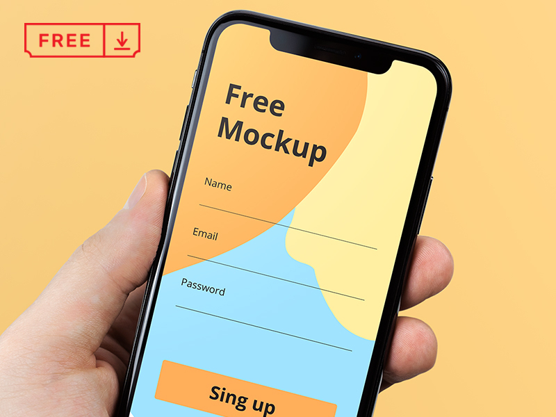
Say hello to a photo realistic iPhone X in Hand Mockup. Present your mobile App or Website in a gorgeous way. Mockup available for ---> DOWNLOAD Follow us: Behance | Instagram | Twitter | Facebook
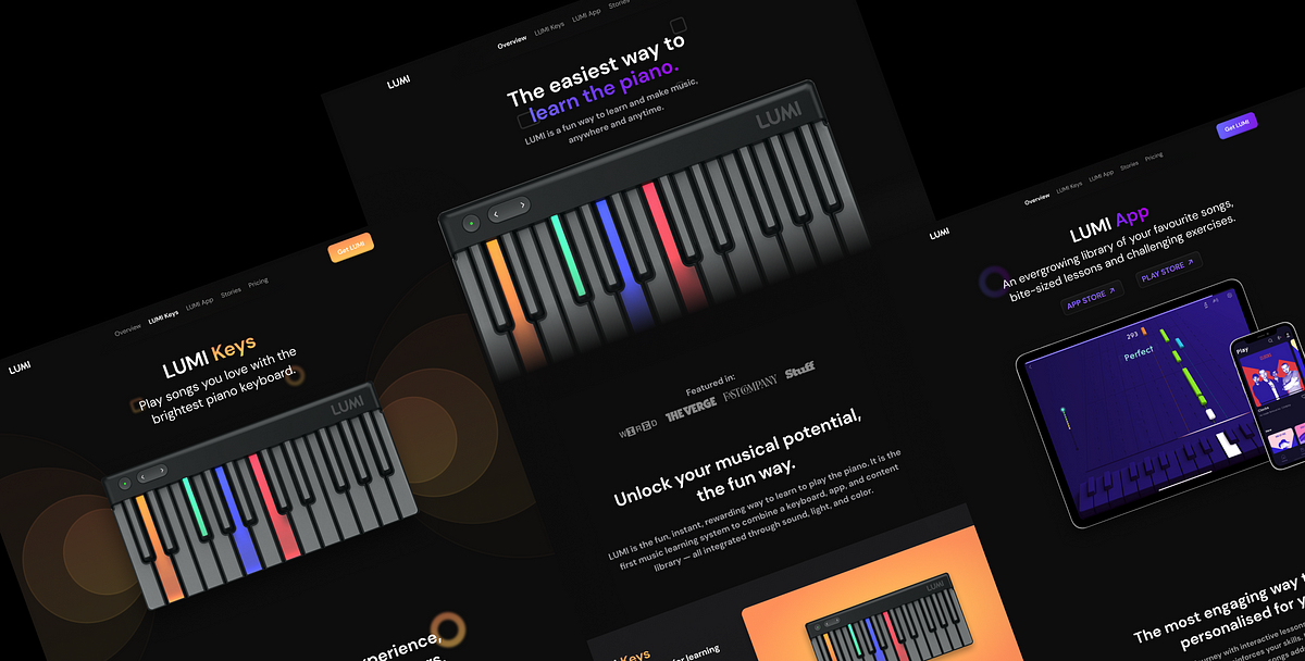
In this case study, I will explain how I redesigned a product website, LUMI from scratch. I will talk about my process, the decisions I took, my approach to this project and what I learned while working on it.Intro to LUMISimply put, LUMI wants to help you make music. ROLI, the parent company of LUMI, already is involved with professional music creation. I’ve explained their products below.🎹 LUMI Keys is a portable piano keyboard. It is ROLI’s attempt to make music learning universally accessible and of course, fun.📱 LUMI App is the companion app to help you with your learning. It lets you access the LUMI Library.📚 LUMI Library is the content library you can access through the app. It is divided into two tiers: Essential and Complete.Picture Credits: LUMIGoalI felt the website already had all the content but a little too much of it. It seemed like information was put on the website just because it was there. It needed some restructuring and a visual boost to take it to the next level. That is exactly what I have tried to do in this project.Let’s get into it. 🎉ProcessPreparationI started by analysing the LUMI website. This helps in mapping out the site and finding every last detail about the products. A couple of times, the FAQ section had information which I shifted to one of the product pages.Moving to the second step, I looked around for inspiration and references. You can use LandBook, Awwwards or OnePageLove for this. This helps in getting some ideas.Once I had a good idea about how I wanted the website, I decided how I wanted the information to be structured. Moved onto some rough layouts. The important things to decide here is the content width. Will the navigation bar stretch? Will your content stretch edge to edge? Try to answer these questions at this stage to avoid confusion.I recommend using Whimsical for this. Regardless of the tool you use, the goal is to have a clear idea for the website.Here’s a screenshot from my Figma fileRedesignAfter analysing the website, I felt there was no particular need to have two separate pages for LUMI Library and LUMI App. Since they are so interconnected, it was best to combine them into a single page, LUMI App.Before starting any page, start with the colours and text styles. This will keep the website consistent and make our work easier. Next, we need to work on the common elements of the website, such as the navigation bar and buttons.Here are some iterations I tried for the navigation barLanding PageLet us start with the landing page. It serves as an intro to all the products by LUMI. A good landing page should be able to answer any initial questions the person might have. It’s important because it drastically improves customer conversion.The idea behind having a dark background is to help the colours on LUMI Keys pop and add contrast to the website. It directs attention straight to the hero of the website, the product itself. A gradient is a nod to the colourful design of LUMI Keys.The first thing I did was add some social proofing to the top end of the page. This is a matter of choice. It adds some assurance right at the start when the person is getting to know about the product.The next step is to introduce the products. There’s a one-line description already but I wanted to give some more details. Generally, viewers just scan the website. They don’t want to sit and read every single line on a website.Breaking down content into points accompanied by some icons helps grab their attention to the important parts.That’s what I did for both the products, too. Notice that in this section, I am also introducing a different gradient for LUMI Keys. I will refer to it later.After describing the products, I’m (and LUMI is) trying to sell it by describing its advantages and features. Here, you will notice that I have restructured the list of features.LUMI’s goal is to make music learning accessible. Being able to learn from home is the single most important part of LUMI products, therefore, deserves to be the highlight. I also took this opportunity to showcase LUMI’s achievement. Pictures are also a form of social proof.When people see other people using a product, they feel more secure about it. It can be the difference-maker in a conversion.As I mentioned earlier, I decided to move things around while analysing the website. I decided to move this content in the product pages from the landing page. Notice the “featured in” section which I used in the beginning.So, that wraps up our Landing Page 🎉LUMI KeysApplying the same approach as the landing page, I want the design to compliment the products and make them the centre of attention. The elements on either side give an effect of audio coming out of the keyboard and direct attention to it. Remember I said I’d refer to the gradient from the landing page? It’ll be in action throughout this page.There’s a lot going on here. There’s a lot of content, I felt it was a bit much. This is where the website analysis comes in handy. I already know the important info. I decided to make this section shorter and little more crispier.UI tip: Use overlay on text to get that nice gradient effect (see above picture).Ending this page with some more social proof and the footer. I think the social proof section showcases my approach to UI in this project very well. Always add depth.A combination of shadows, background elements and materials adds depth, hence adding character to the page.LUMI AppTo keep things consistent, both product pages have a similar layout. So instead of discussing the layout and the decisions I made, I am going to discuss the UI.Hero section for LUMI AppLet’s start with the hero section. I’m using the iPad and iPhone mockups to indicate support for these kinds of devices (tablets and phones). The blurred out LUMI Keys in the background will be cut-off when viewed, which indicates that the page is scrollable.Subtle cues to indicate behaviour are useful tricks to help in guiding the user.Custom App Store and Play Store buttons serve as quick links for people who already have LUMI Keys and want to get the app.I am also using random shapes along with LUMI Keys to add depth to the page. You might have noticed this in other redesigned pages as well.Features section in LUMI AppMoving onto the Features section. The standout part of this design is the use of depth. Initially, I use materials to create some.Materials create a translucent effect which gives a sense of depth and adds more context to the design.Of course, when text is present over the material, a thicker material (heavier blur) should be used to maintain legibility. Thicker materials are still more contextual than solid backgrounds.In the next part of this section, social proofing, I am using a lot of different elements, shadows and blur on top of them to create a sense of depth.Pricing and Footer for LUMI AppI know what you’re thinking. “Wow, this guy just can’t get enough of b-l-u-r.” You’re absolutely right. But setting aside UI for a second, let’s talk about why I designed the pricing section the way I did.On the left, you see a monotonous LUMI Essential with a lot of empty space left. On the right, you see a colourful LUMI Complete with some fullness to it. This is a tactic to push the viewer towards LUMI Complete. The emptiness on the left indicates that LUMI Essential is incomplete. The monotonous appearance makes it look dull compared to LUMI Complete.Back to UI, let’s talk about that subtle gradient above the links for Overview and LUMI Keys. It’s a simple gradient that fades away quickly but manages to indicate where a section ends and another one begins. This is another one of the tricks you can use to guide the viewer. I used it again in the footer to create two sections in it.With that, we completed the redesign 🏔Wrap UpThis project was an awesome experience for me. I haven’t worked on a lot of website design projects and this really helped me get going. Here’s what I learned:Preparation is 80% of the work. Analyse competitors/similar websites, come up with the IA and lay out your plans before designing a single pixel.Iterate, iterate, iterate. Make 10 iterations for each section. You’ll be amazed by how many smashing designs you can make. I added a glimpse from my archive as an example.My iterations archive in FigmaBefore taking up this project, I prepared myself by redesigning an AR app, Acute Art.Making art accessible to everyone via ARRecently (but not so recently), Apple announced Widgets for iOS. To help you get started, I made a guide for it.Designing widgets for iOS, macOS and iPadOS — the ultimate guideIf you enjoyed this case study, let me know with 50 claps 👏😷 Stay safe, wear a mask and have a nice day.🏳 I do not own any of the product photos used in the redesign and in this article. Most of them are from LUMI’s Facebook or Instagram. Credit to Sennep for the LUMI App pictures.Strengthen your Landing Pages –LUMI Website Redesign (UI/UX Case Study) was originally published in Muzli - Design Inspiration on Medium, where people are continuing the conversation by highlighting and responding to this story.
via Muzli design inspirationLooking for more daily inspiration?Download Muzli extension — your go-to source for design inspiration!Web design inspirationPolestar — Electric Cars.Units™ — Investments In Future Of Living.OFF+BRAND.Hugo HoppmannDesign ResourcesIconicool V.2 / +800 unique IconUnlock Iconicool V.2: Elevate Your Designs with 880 Unique Icons.Flowify — Dynamic Liquid Gradients30 Vibrant Gradient Backgrounds.Zenso — SaaS Website TemplateZenso is a unique template designed for companies in the SaaS, AI, Startups and Tech space that are looking to upgrade their online presence and improve the conversion rate..Process — Designer Website TemplateIntroducing Process, the ultimate Webflow template tailored for web designers, digital agencies, entrepreneurs, creatives, and social media agencies. With Process streamline your workflow, making it effortless to showcase your work.Product SpotlightAnimation Rigging3D Animation and Automated Rigging platform powered by Machine Learning. Unlimited 3D models for games, apps and the metaverse..SmartSlideCreate Slides in seconds with ai.Clay Mockups 3DCreate mockups with 3D clay-style device models. Customize the color, camera angle, and device model for your mockups. Includes models for the iPhone 11, Pixel 4, and Macbook Pro..Rotato 3D Mockups + ExplosionsWrap any Figma frame in a 4K ultra-realistic 3D mockup device frames for the perfect showcase in your slide decks, landing pages and portfolio. Or, grab screenshots directly from your iPhone via a USB cable. Without leaving Figma.Design inspirationHealthcare service — Mobile app by Anastasia GolovkoDigital Agency Landing page by Ghulam RasoolE-commerce Website by AwsmdSaas Dashboard by AwsmdRetro Monster Party. Vol.1 by Alex KrugliEMOIL machine oil by Tim Harrison and Tom BennettS&P Branding by Nick BarclayPackaging design by Hanna KarahinaWeekly Designers Update #422 was originally published in Muzli - Design Inspiration on Medium, where people are continuing the conversation by highlighting and responding to this story.
Raw Design Inspiration: Hand-picked on Dribbble AoiroStudio07.19.20 Inspiration is one of the biggest fuels in my everyday life. Whatever it is for life and work balance. That being said, inspiration comes in many shapes and forms. For me, I do enjoy a good surf on Dribbble. It's all about how we consume our feeds, I noticed a shift of change from designers on sharing their work on Instagram. I might be an old-timer but I am not too keen on sharing work for likes and shares, I do enjoy the good 'old' Dribbble. It's always gratifying and you usually do find something to spark your mind. Introducing abdz. 'Raw Design Inspiration' No theme. Pure and 'raw'. The concept of 'Raw' is to randomize what inspires me to kick off my week, maybe it could have the same effect on you. Perhaps it's an homage to abdz. daily inspiration series, it's an experiment, and we’ll see how it goes. If you do have a suggestion, you can submit your work. More on https://dribbble.com By David Kovalev ◒ By Louie Mantia By Stripe By alon_kelakon By dudenas By Zhenya Rynzhuk By MUTI By Stian ◒ By Tran Mau Tri Tam By Filip Justić By Eashin Arafath By adiatma bani By warehouse_logo By Logo Templates By 𝔍𝔲𝔰𝔱𝔦𝔫 ℜ𝔞𝔫𝔡𝔰 By Fabian Krotzer By Adam Johnson By Colin J Baker By Gustavo Zambelli By Jonas Mosesson
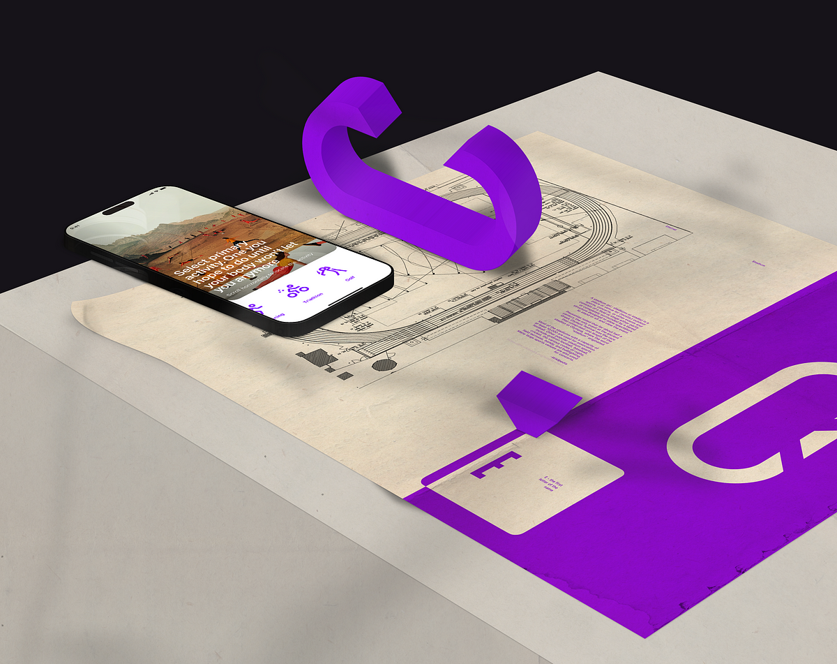
Maxim Aginsky created a visual language, and design system that will be used to create the Mobile App, Website, Seed Round Pitch Deck, and the brand materials.What problems does the app aim to solve?The app helps users track important health & performance numbers as they age. They will take performance tests, get blood tests, and medical scans and we will track their numbers over the years.Who is the intended audience?Athletes (cyclists, runners, golfers, surfers, skiers, etc.) over 40 years old.The case study chaptersLook & feelDelivered materials. OverviewMobile App mockupsSeed Deck templatesDesign system foundationsDesign System markHero illustrationBrand markMobile app workflow. Selected viewsCompositions and fragmentsMobile app views refinement processApp Store Screenshots and previewsLook & feelThere is no better way to ensure that your design is good than by combining different elements, screens, and patterns. These pieces, like a mosaic, come together to form one composition. This allows you to see if the visual language is efficient and powerful enough. It also helps you to identify any missing elements and areas where improvements are needed.By combining strong compositions from the materials you develop, you can be confident that you are on the right path.It’s proof that this concept has practical potential.A good composition is one in which the elements are thoughtfully put together and where any arbitrary area has artistic value. A good composition is a sequence of failures, in which the last failure seems successful due to fatigue.We must value the time of others as we value our own. Therefore, thoughts put into words must be thought through three times. This principle illustrates my workflow well.Delivered materials. OverviewPresentations are vital to any growing business, and when you’re pitching to potential investors, your presentation documents need to be well thought out and visually well-developed.By pitching to investors, you demonstrate your level of knowledge, talent, and professionalism. If you have low visual standards, your potential partner may assume that you could also potentially cut corners elsewhere.To increase your chances of winning this round, good design is critical.Well, you’d probably asking yourself: what the hell is this about, right? Well, this is simple. Presenting to an investor or a client means the same thing to me.Mobile App mockupsSeed Deck templatesThis document provides templates to guide you on how to use the system effectively. Use the examples in this document as a reference to design your ideal deck.Deck cover. Will be used only once — as the first pageExample with the textual content, an image, and a highlighted (underlined) word or a few wordsMid contrast — default themeAn example of the textual content and mobile app mockLow contrast — dark theme.A new chapterHigh contrast themeA new chapter — low contrast themeAn example of the textual content and mobile app dark theme mocks. Low contrast themeIndividual Thank You page. Template “A new chapter”Individual Thank You page — high contrast themeDesign system foundationsText, Spacing, Color, Shape & Art styles.Foundations are necessary for creating simple and engaging end-to-end user experiences, achieved through consistent text, spacing, color, shape, and art styles.ColorColor reinforces consistent experiences across products and should be used as a driver for context. The colors should express hierarchy, state, and more.Color is one of the instruments to emphasize the order of importance within a structure.TypographyIt is important to use consistent typography in order to communicate the high quality of the product. By maintaining consistency throughout both the Seed Round Pitch Deck and the mobile app, users will perceive them as a unified product, which can increase the level of trust during the presentation.UI — Each font is carefully selected to convey the appropriate sentiment and to assist the user through each stage of their journey.Maintaining consistency in design can increase the level of trust between parties during the pitch presentation.SpacingA spacing system simplifies the creation of page layouts and UI, resulting in a more harmonious end-user experience.ShapeElements with rounded corners convey a refined look, compared to sharp rectangular shapes.ArtIllustrations should be meaningful and reflect a user’s context and emotional state, as they help convey complex ideas in a simple way.A hero illustration aims to convey a complex narrative, which gives it the freedom to be more metaphorical and imaginative. The illustration should evoke a feeling of physical activity. It includes over a dozen athletes, and its complexity should be adjusted depending on the intended size.Design System markThe Design System mark combines the circle with no beginning or end, which is the most perfect shape, with the letter E, the first letter of the company name.“As Pythagoras would say, the circle is the most perfect shape, it withholds all and everything emerges out of it. Every point of the circumference is the exact same distance from the center. The circle has no beginning and no end, it is infinite and stands for non-existence and eternity. The circle is, to a certain extent, the oldest of all symbols. Easier to illustrate is only a point — and that is basically a circle as well; a very small, filled one, but nevertheless a circle.Taking a closer look at the point and circle we already reach the core meaning of the circle’s symbolism: The circle is the outer expression, the construction; and the point is the absolute key aspect of the symbol, the core which everything turns around.”-Thoth AdanHero illustrationGroup training in a stadium is a fitting theme for the main illustration representing the Eternal product. This idea fits perfectly with the core concept of health and hints that communication and exercise are the keys to longevity.The stadium is a cross-cutting theme. The group workouts take place in a stadium, the brand mark is based on the stadium’s shape (stadium running track’ shape).Rationale: the brand mark is based on the stadium’s shape; the group workouts take place in a stadium.Brand markThe brand mark combines the stadium running track (a place meaningful for athletes) shape with the letter E — the first letter of the company name.A stadium (pl.: stadiums or stadia) is a place or venue for (mostly) outdoor sports, concerts, or other events and consists of a field or stage either partly or completely surrounded by a tiered structure designed to allow spectators to stand or sit and view the event.Pausanias noted that for about half a century the only event at the ancient Greek Olympic festival was the race that comprised one length of the stadion at Olympia, where the word “stadium” originated.Most of the stadiums with a capacity of at least 10,000 are used for association football. Other popular stadium sports include gridiron football, baseball, cricket, the various codes of rugby, field lacrosse, bandy, and bullfighting. Many large sports venues are also used for concerts.WikipediaThe Semites, over 3,800 years ago, pronounced the letter E as “Heh” and was symbolized by a human body. According to experts, the Semites might have borrowed it from an Egyptian hieroglyph with a different pronunciation.It was not until 700 BC that the letter began sounding like it does today — /e/ or YEE. The Greeks, according to linguists and historians, in 700 BC borrowed the letter and tweaked it to sound like the modern E.According to experts, E is a feminine letter that symbolizes the Egyptian goddess Isis, the Roman’s Diana, and the Greek’s Aphrodite.In religion, the letter E stands for the breath of God, man, Mother Earth, and feminine energy. The letter E also signifies enlightenment, ecstasy, and intuitive wisdom.According to various esoteric teachings, E or heh signifies the wisdom of God or the act of the almighty bringing forth the creation. As per different schools of thought, the Ultimate or the Supreme Being controls universes (multiverse), alternate realities, and individual beings through his/her/its breath.The letter signifies MAN — Master-Able-Noble. According to the MAN philosophy, a man must fight over his animalistic nature and master his five senses to ascend to higher realms of existence or merge with the Supreme Reality.DesignbroMobile app workflow. Selected viewsA series of tasks that were laid in front of me, were addressed considering common interaction patterns that have become evident over the past few years. Information design is crucial to creating a user-friendly interface and interactions. During this stage, I will make critical decisions that will impact the later stages of the product design process.Here you will find a series of steps for each view that uncover the motivation and thinking.Some of my decisions were influenced by the need to consider that the mobile app mockups have to illustrate the document, which means that I do not have complete control over redesigning wireframes. Despite this, I am pleased with the resulting materials.The overall principle is to express your thoughts regarding something if you have any.Onboarding — Sport selectionI am beginning to conduct visual tests once I have a good idea of what information design should be.Onboarding — Age selectionThe reason for removing the outlined information is that it’s not relevant to age selection, which is the main focus of this view. This type of content should be included in the core application and not in the onboarding process. Additionally, information such as “You will need to be healthy enough to live longer than 3% of men” may potentially frighten the user at this point.This is the second screen of the IA stage, but I have already created at least two dozen visual tests, searching for the mood that I want to develop. This shows how important visual design is to me.Welcome — Intro to coachI decided to replace the vertical scroll with sections by introducing tabs. This change was made to minimize the amount of scrolling required and to make it easier for users to navigate through the different sections of the page.The first section is dedicated to scheduling time with the coach, and therefore, the call-to-action (CTA) button has been made more prominent.Welcome — Todo listIn order to arrive at the optimal solution, it is crucial to possess a comprehensive comprehension of the entire process. It is possible that the status may appear as part of the bottom navigation.I have made a simple calculation of 1+1=2, apart from the first two sections, the remaining sections are identical to those on the previous screen. Therefore, I have grouped them together by introducing top tabs.Results — Result availableInformation understanding.The result available is a notification that the user needs to be able to receive on any page of the app when the result is ready. Additionally, the Results page is needed to host all results — could be included as another tab in the bottom navigation or in the main menu. A full IA is needed to make the final decision.Welcome — Current statusResults — Scan overview (key screen)The same as before (Welcome — Intro to coach).The key to a user-friendly system is the similarity in the usage of the pattern. I’m replacing the multiple sections (scroll) with the top navigation.Results — Charts (Body fat %)Introducing collapsible sections for improved content visibility.Fast scanning and hierarchic organization help to aid navigation.Results — Charts (Body fat %) / Score contextThe table re-design.Compositions and fragmentsTo ensure that you are heading in the right direction, there is no other way but to test your materials. By combining them in different sets, you can determine whether the visual language you are using is efficient and powerful enough.If you can create good compositions from the materials you develop, then you are on the right path.Live harder, longer. Seed Deck and Mobile App first user interactionSelect primary activity. Mobile App login and onboarding screensSelect primary activity horizontal scroll behaviour. Eternal Mobile AppButton components. Eternal Mobile AppActivity types. Improving athletic span with sport-specific programs. Eternal Mobile AppNo one has brought all three together in one truly magical experience. Eternal Seed DeckEternal Logo explaining. The circle is definitely eternalArtwork experiments. Eternal Seed DeckAlternative approachTesting the visual language behavior when using a very different cover image — Maicel Uibo, of Estonia, rubs a block of ice on his face during the decathlon pole vault at the 2020 Summer Olympics, Thursday, Aug. 5, 2021, in Tokyo.I’d say — acceptable, but not as good as a more generic and artistic version, where the balance between the elements is just perfect.Notification. Responsiveness edge cases. Eternal Mobile AppNotification. Experiments canvasCardio exercise strains your body’s cardiovascular system, elevating your heart rate and requiring your body to pump blood efficiently. As a result, cardio can lead to improved overall health in the long term. Work on your heart rate to pump blood efficiently. Move your ass.Case study cover imageAn iPhone mockup with an activity selector step (onboarding), a 3D (Photoshop) brand mark, and a brand mark concept printed on vintage paper were combined to create a realistic mockup. V2A brand mark concept printed on vintage paper. V2Design systemDesign System Foundations. Vintage paper printThe chart element takes center stage on the website’s home page, as Dexa Scan is the key deck’s screen according to the client’s brief.If it serves the purpose, things can be presented even upside downDesign System Foundations / ArtDesign System Foundations / ColorMobile app views refinement processDesign is like a language — the more you practice, the better you get at it. During the course of my work, I realized that certain screens had not been designed using conventional patterns. Therefore, I began to search for a solution to this problem. The following report outlines my process and findings.The result of the refinement processApp Store Screenshots and previewsGreat content can be presented in unconventional ways — upside down. Especially if as a 50x+1 user who downloaded and created an account you will receive a $750 discount. Isn’t that cool?Now, let’s get down to business. The upside-down screen format puts the chart (core element), at the center, giving it a better focus compared to a traditional portrait orientation. The key takeaway is that anything can work if it’s done correctly.As I once said,Art is not design, but design is art.The design of art. May 2021This holds true even today.Inspiring App Store product shot for your startup iPhone App_______________Follow me on:Behance | Dribbble | LinkedIn | Instagram | Twitter | CssfoxDesigned in partnership with Arrowww — A full-service creative design and development Montréal-based studio that celebrates every project.Eternal. Mobile application designed for athletes was originally published in Muzli - Design Inspiration on Medium, where people are continuing the conversation by highlighting and responding to this story.
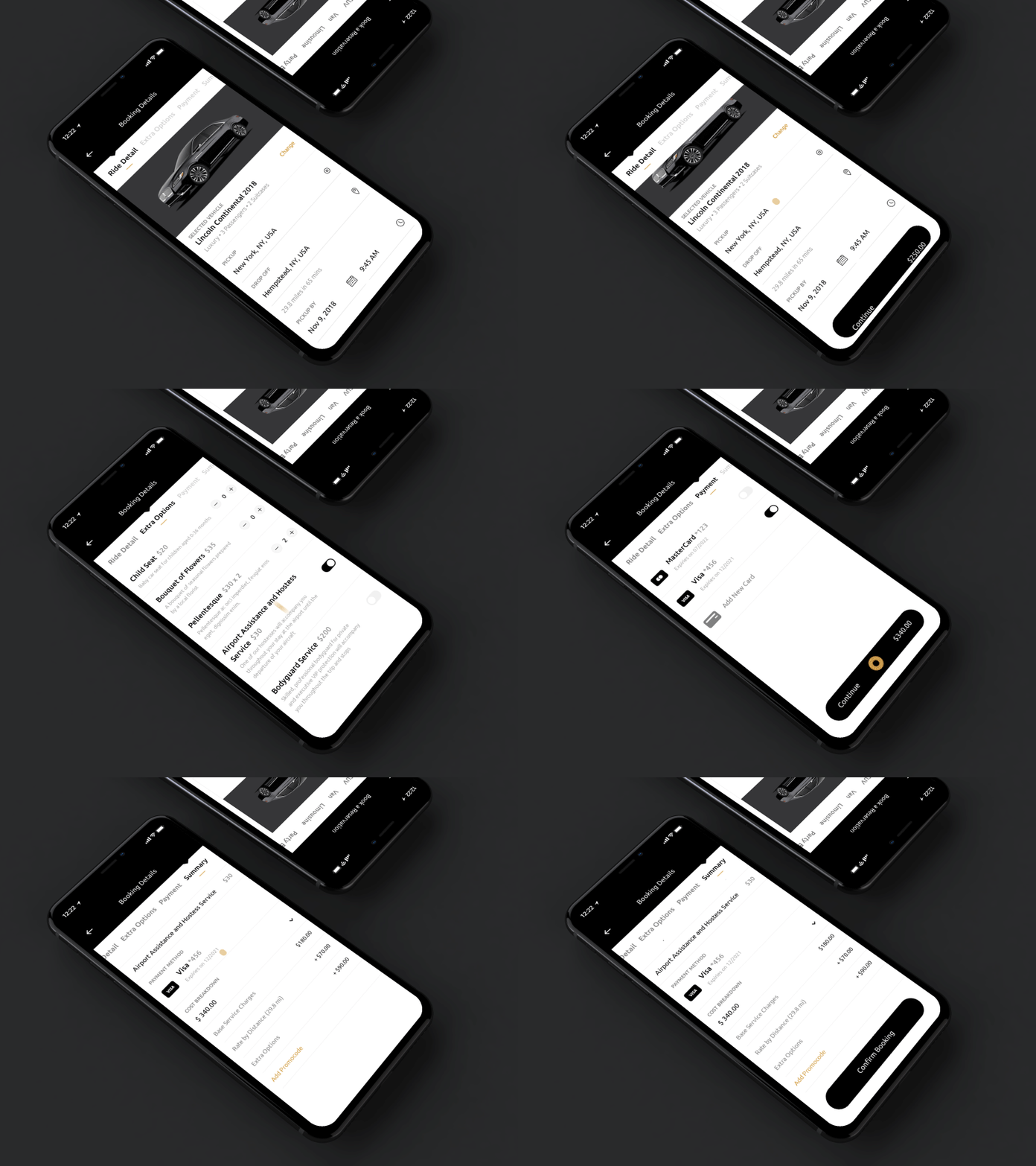
Hey dribbblers, Working on prototypes of Luxury Ride Booking app. Here's the flow of ride booking. Feel free to give your feedback. iPhone Mockup by @[151389:Super Crowds inc.] Twitter / Instagram / Email
![iPhone X & 8 Angled Mockups [PSD]](gif/iphone_x___iphone_8_angled_mockup_template_psd.gif)
iPhone X and iPhone 8 mockups in PSD. These portrait angles perfectly accompany any App Store screenshots or an app website. All these mockups are waiting HERE 🔥
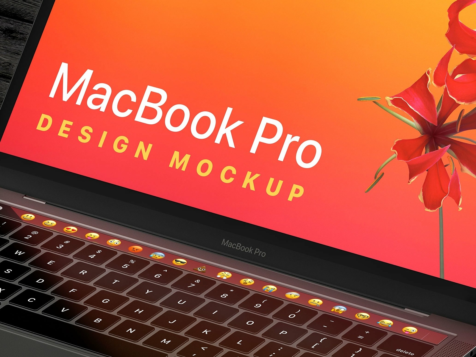
**DOWNLOAD LINK** https://creativemarket.com/Modisana/3324811-MacBook-Pro-iPhone-XS-Design-Mockup?u=KVArts A high resolution photoshop document of the Apple MacBook Pro with TouchBar and the iPhone XS. Created for general design mockups and presentation, especially perfect for showcasing your app and website designs. Features • High Resolution 6000: x 4000 pixels • 200 DPI • Adjustable Background Colour • Compatible with Photoshop • Easy to edit Smart Objects • Bonus Light & Dark Clay Renders
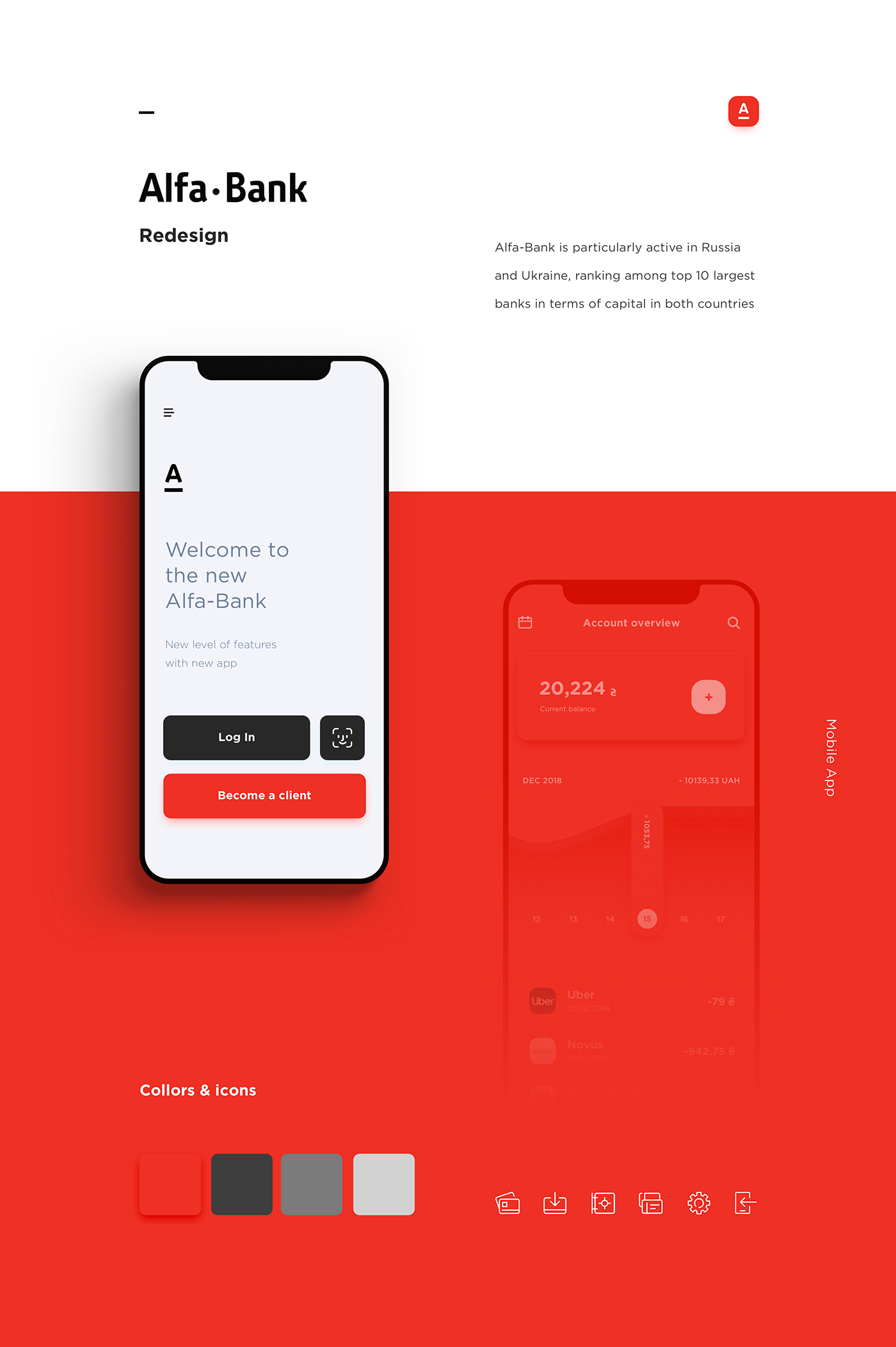
Alfa-Bank is particularly active in Russia and Ukraine, ranking among top 10 largest banks in terms of capital in both countries. Our goal was to create simple and user friendly banking mobile app.
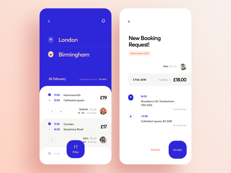
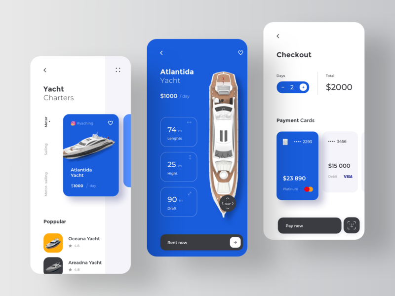
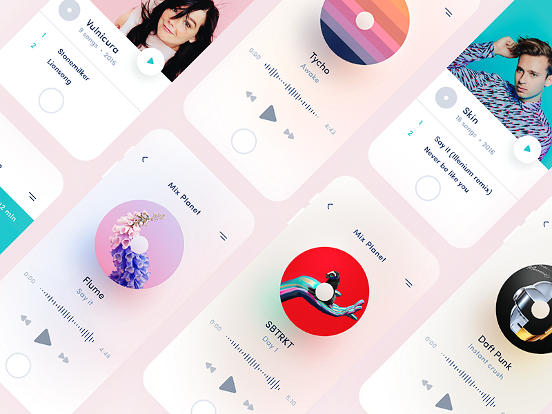
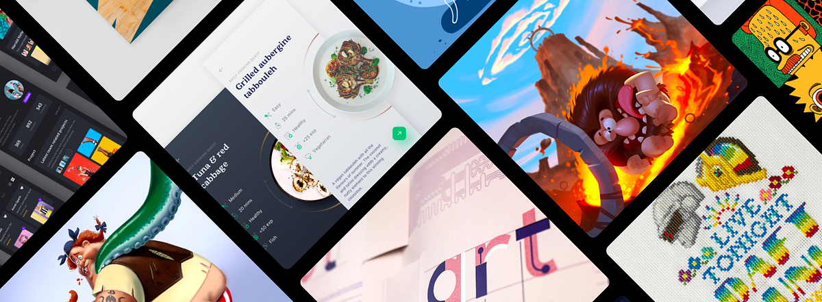
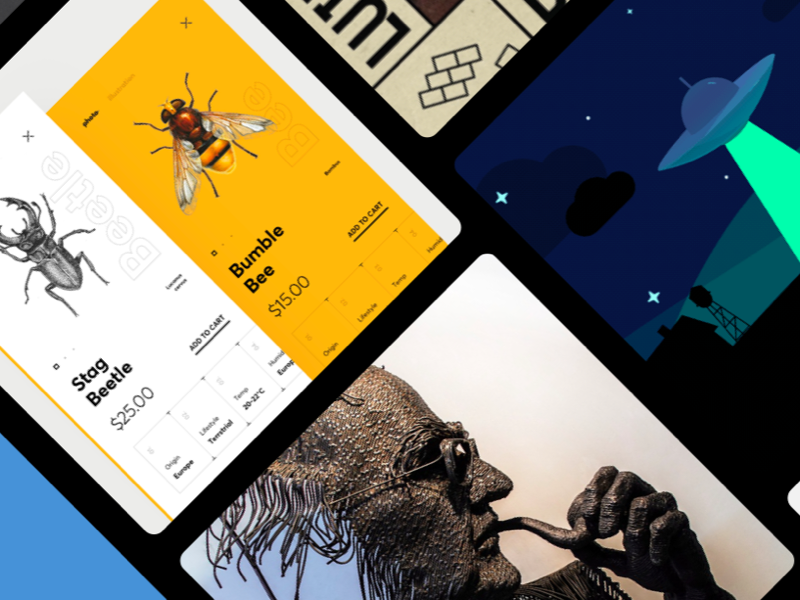
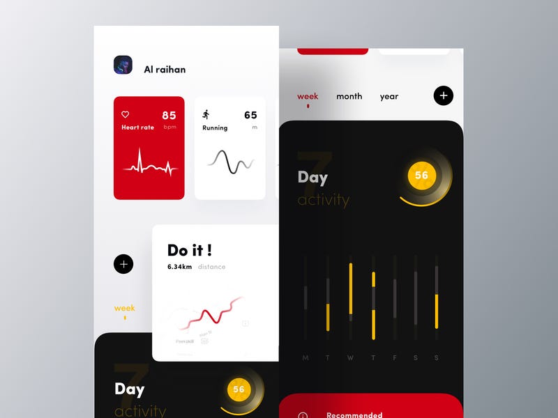
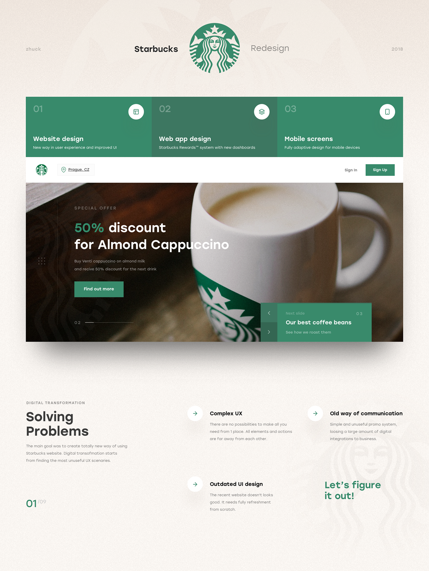
This is my biggest project ever. I made a lot of analytics, wireframes, mind maps and tons of UI design versions of each card, block and page. And here it is.
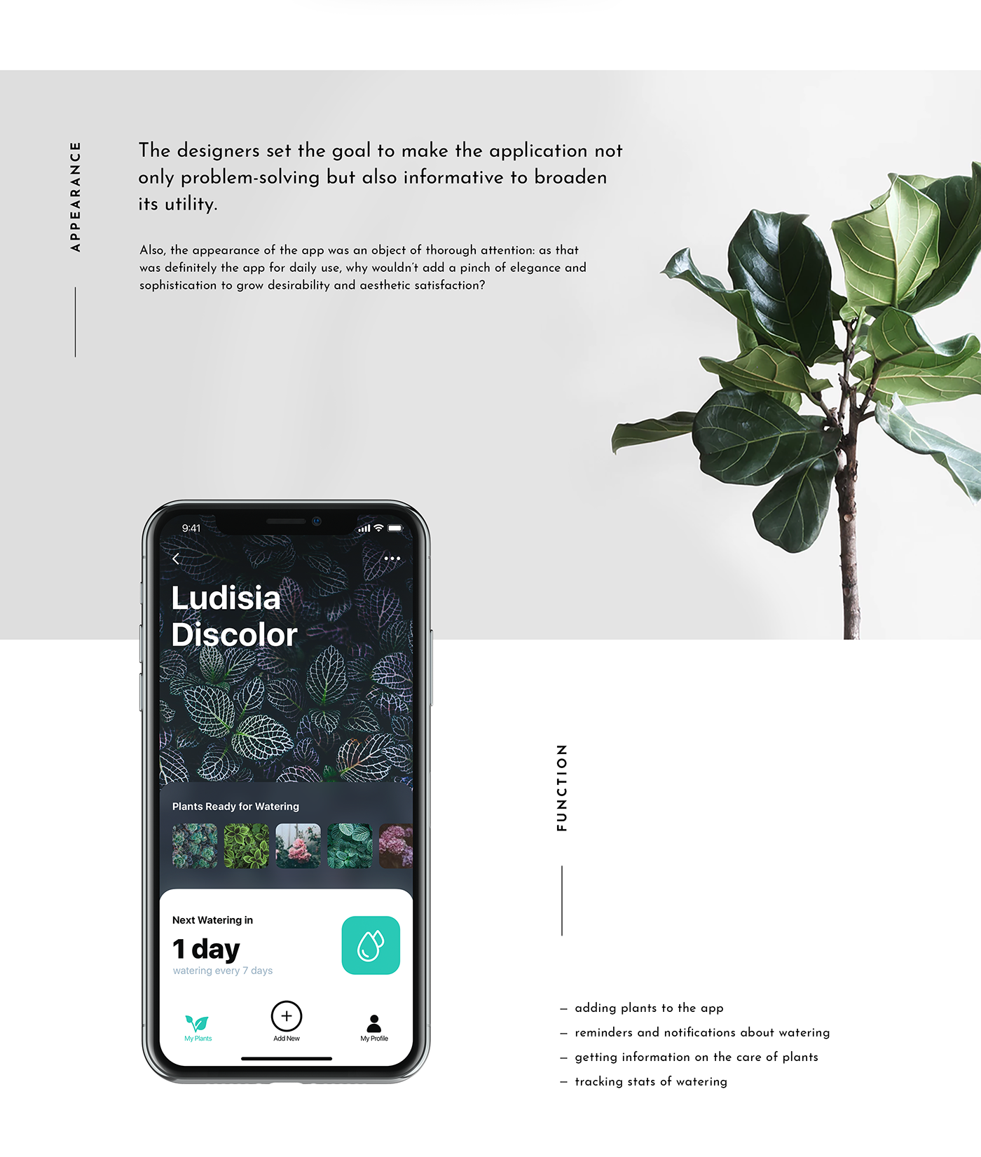
In our routine full of diverse tasks, mobile apps have become great help. Today we share UI concept for one more called Watering Tracker, reminding users to water the plants as well as tracking the watering stats for every plant. To read a detailed case study, check Tubik Blog https://tubikstudio.com/blog/ Join in!
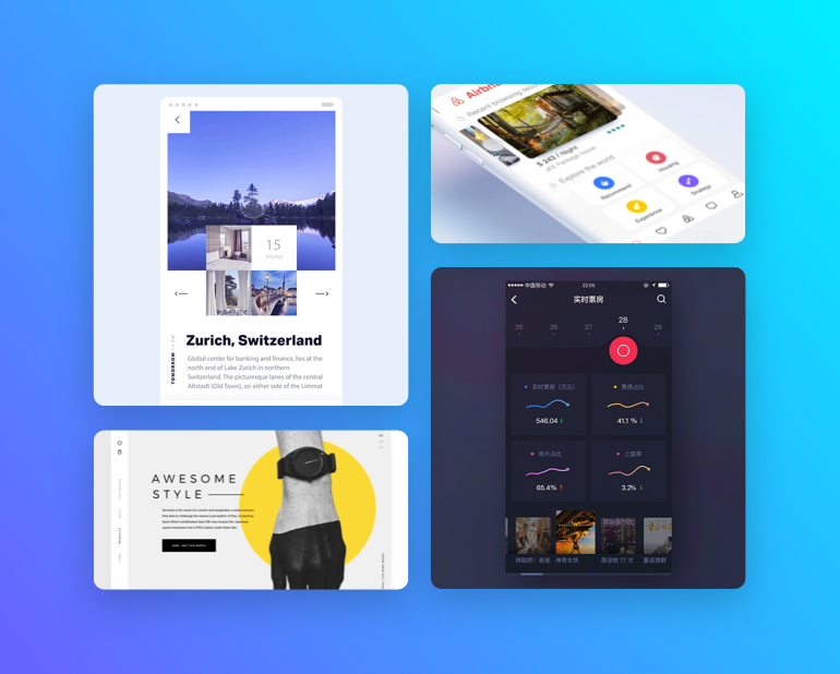
Get access to thousands of freshly updated design inspiration pieces by adding Muzli to your browser.
Loved by 750K designers worldwide, Muzli is the leading go-to browser extension for creative professionals.