
Bento Cards: Multipurpose
Sponsored
We curate topical collections around design to inspire you in the design process.
This constantly-updated list featuring what find on the always-fresh Muzli inventory.
Last update: 8/21/2024

Sponsored
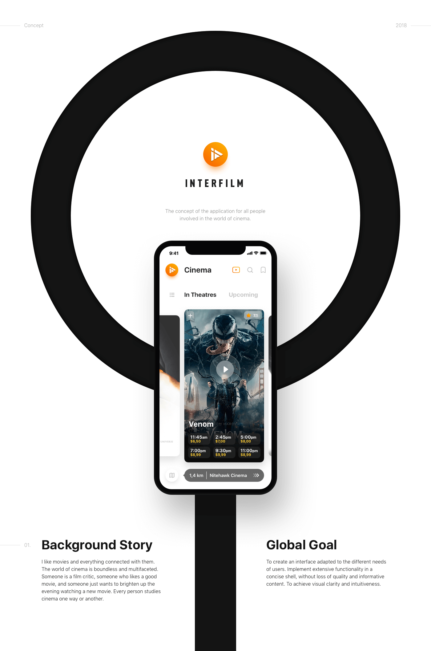
We all love good movies. We all love cinema as well. We collected all the tools of a film fan in one application and made them as convenient as possible. It was a good challenge and a wonderful experience!
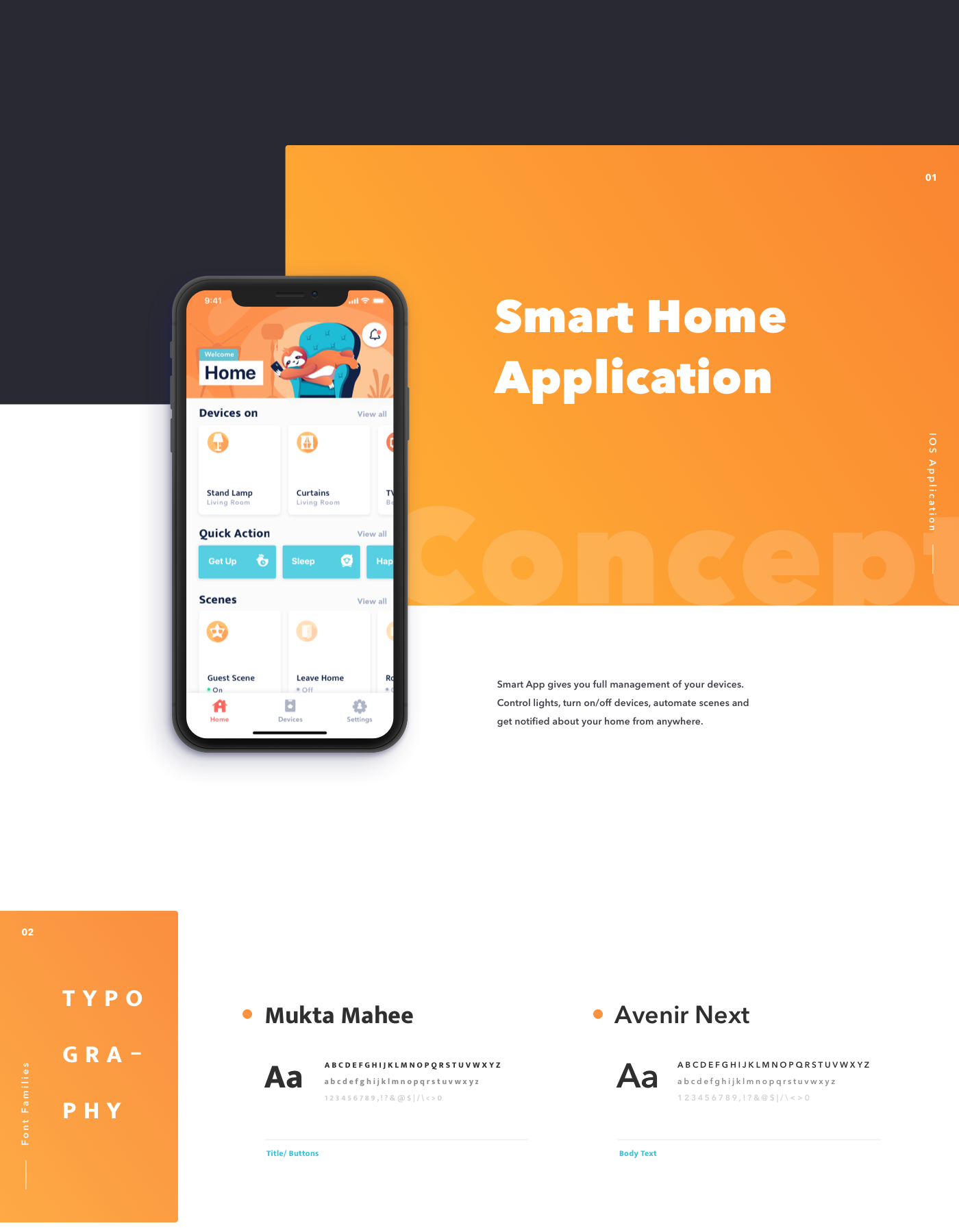

An application to search charging stations for electric vehicles quickly and easy.
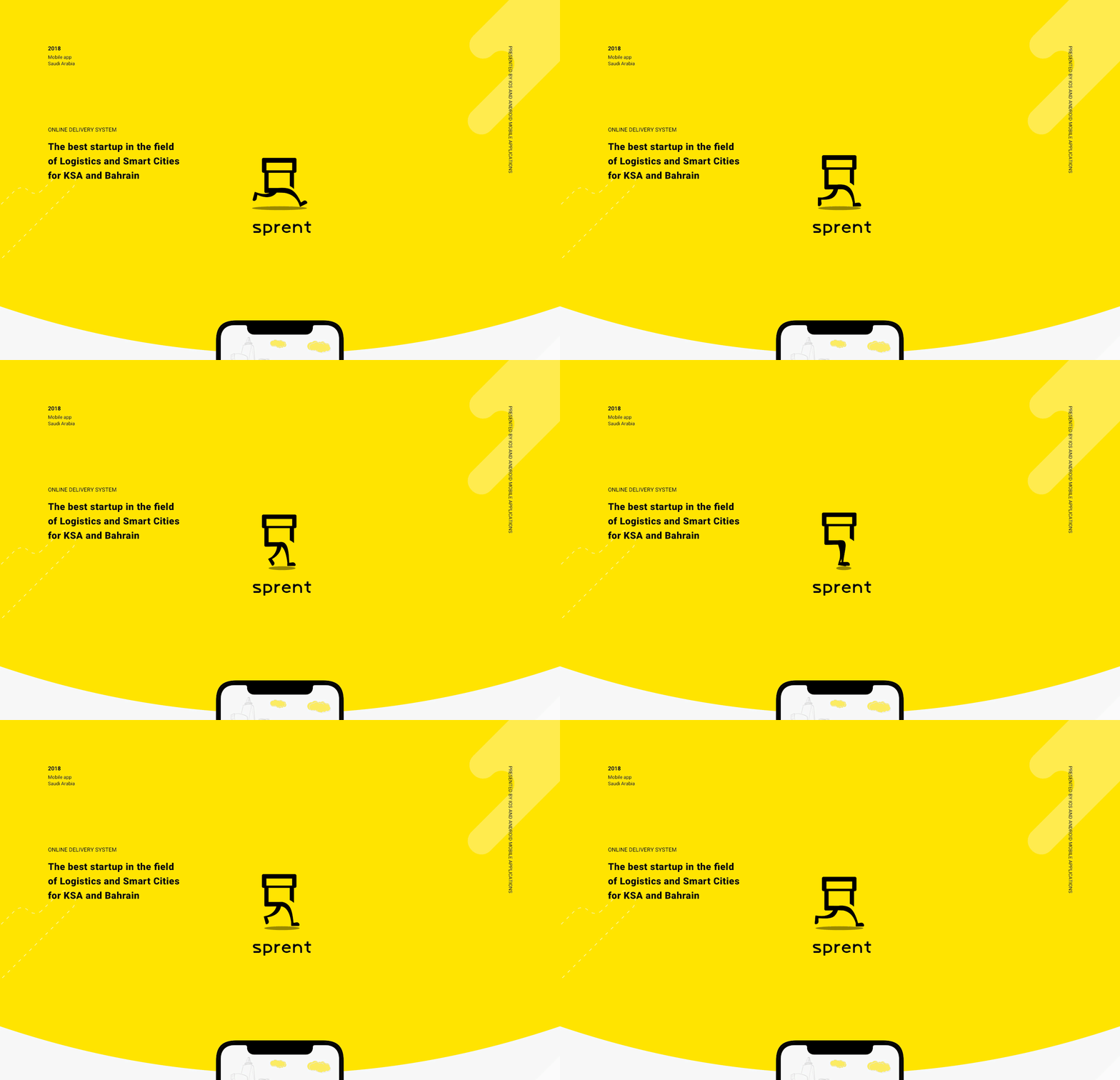
Sprent is an online delivery system that enables customers to buy anything from any store inside their city. Just open Android or iOS app, pick your category of interest and have it delivered by our team of “Sprenters” in a matter of minutes. Customers may also send urgent packages inside their city. The service works in Riyadh and Jeddah in Saudi Arabia, and expanding the coverage to other cities in the kingdom. Uptech provided the services of UX/UI Design, Backend development, iOS & Android development. Sprent was featured by Apple as the 1st app to launch Apple Pay in Saudi Arabia and became the best startup in the Logistics category by GESALO.


Datatrip is a mobile application that allows the user to remember their trips in a totally different way: data. Focusing on an intuitive interface, this app’s main objective is to offer an analytic and informative way to view the places a traveler has explored.
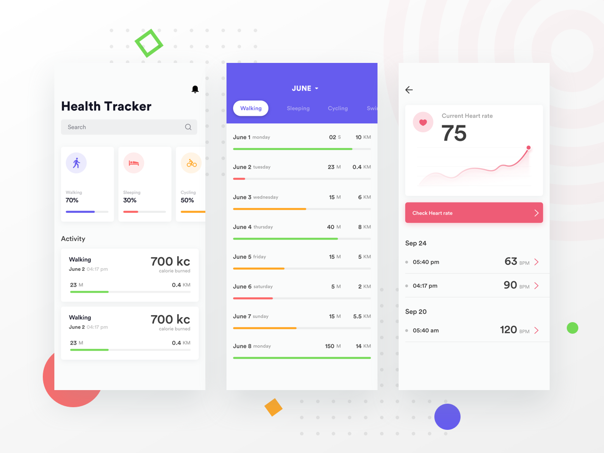
Worked on a concept of a health/fitness app.hope you'll like it :) For more updates Dribbble | Instagram | Facebook | Twitter For crafting your ideas. Shoot us mail chillingmantis@gmail.com
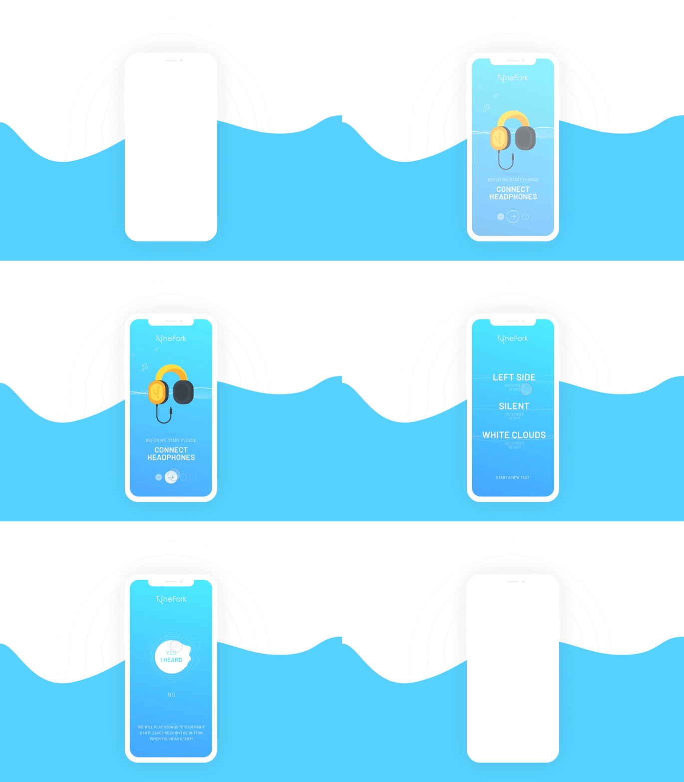
We developed design for an audio personalization app. Within the frames of this project, we created two different variant of UI design and our client chose what he wanted.
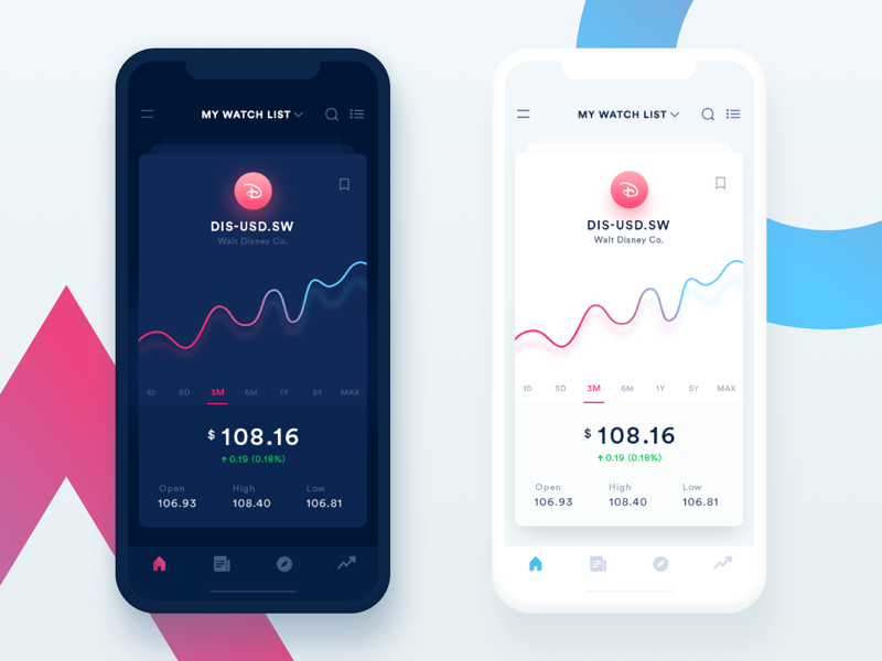
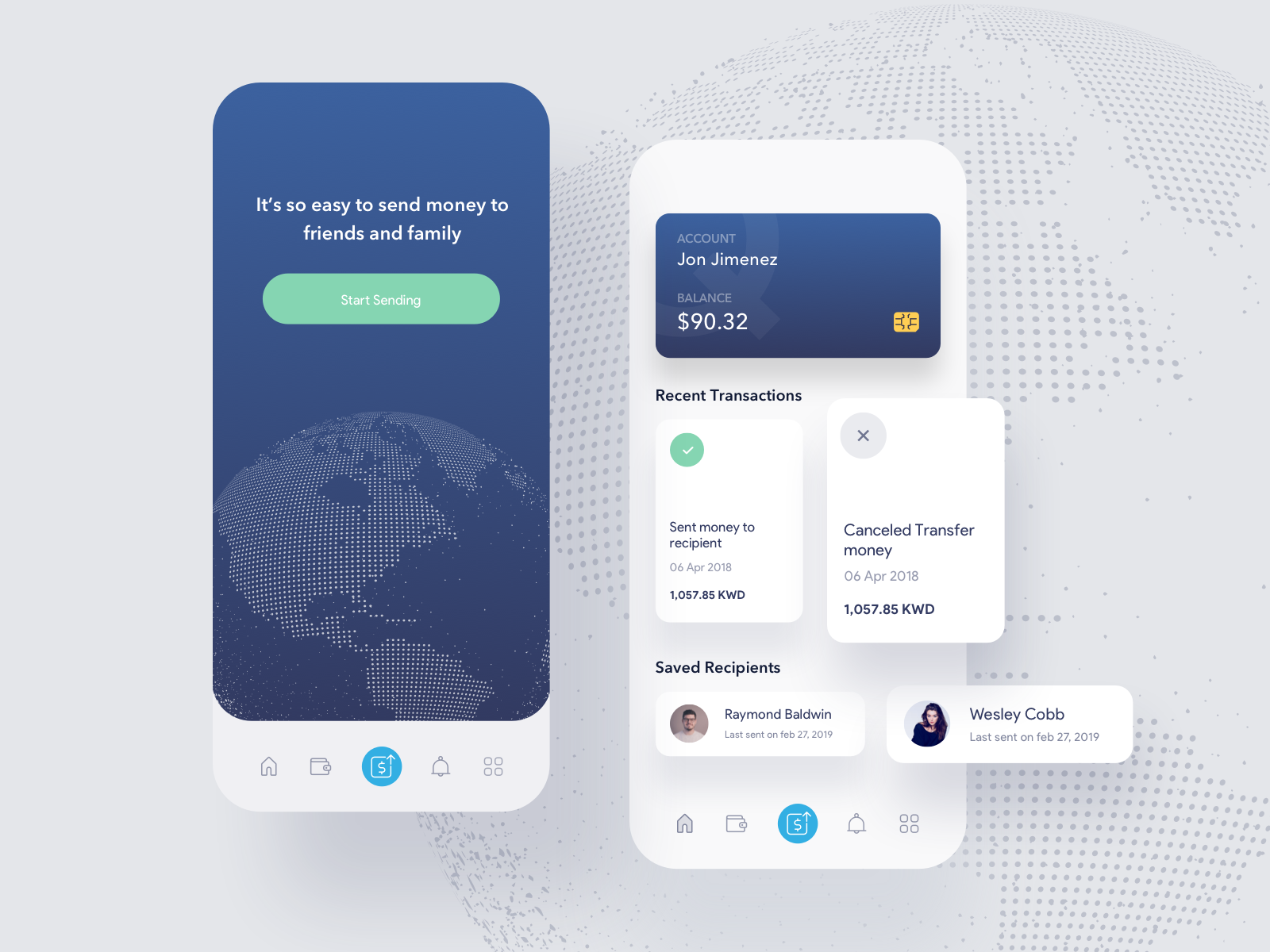
Hi Folks, Currently working on productivity app, a to-do list app, Exploring it in a different style, look and feel. hope, you'll like it :) Check it out here ================================= Follow our Team : NICE 100
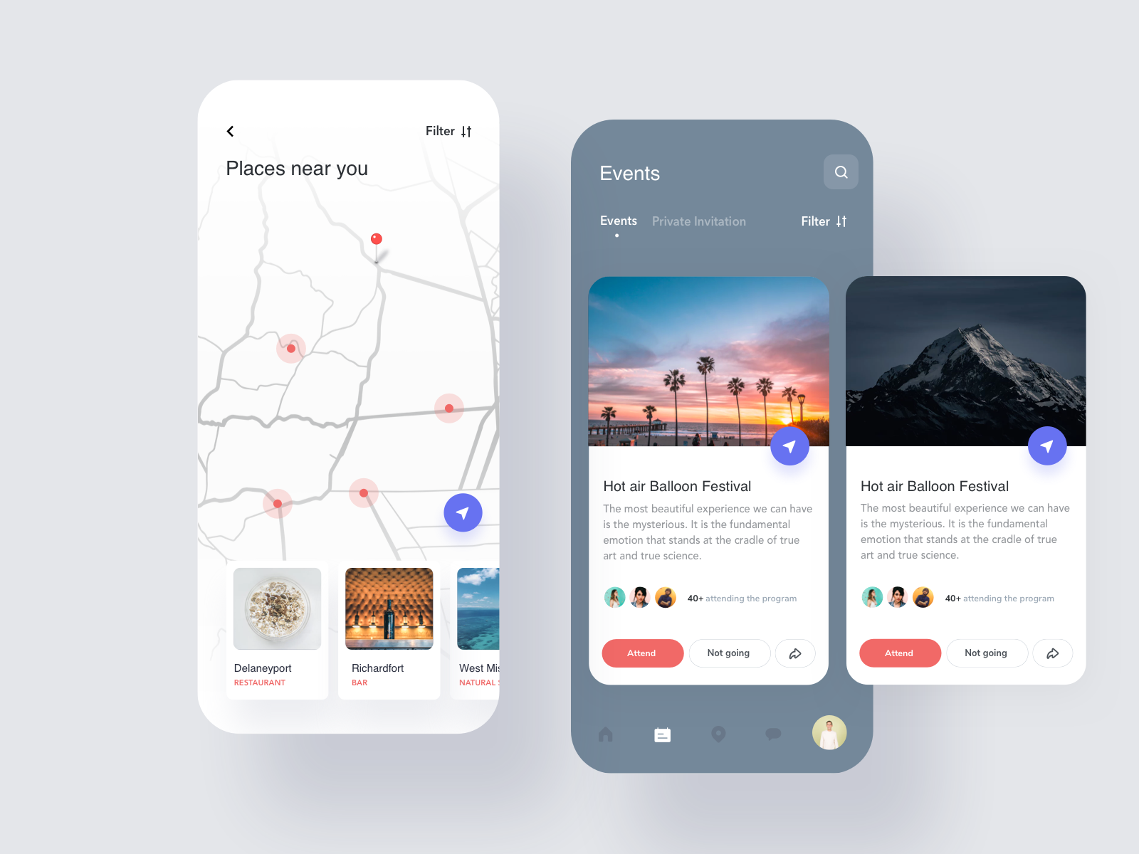
Hi Folks, Currently working on social networking app, an app for connecting with people, events, explore places etc. Exploring it in a different style, look and feel. hope, you'll like it :) ================================= Follow our Team : NICE 100 ======================================== 🔔 For more updates : Behance Instagram
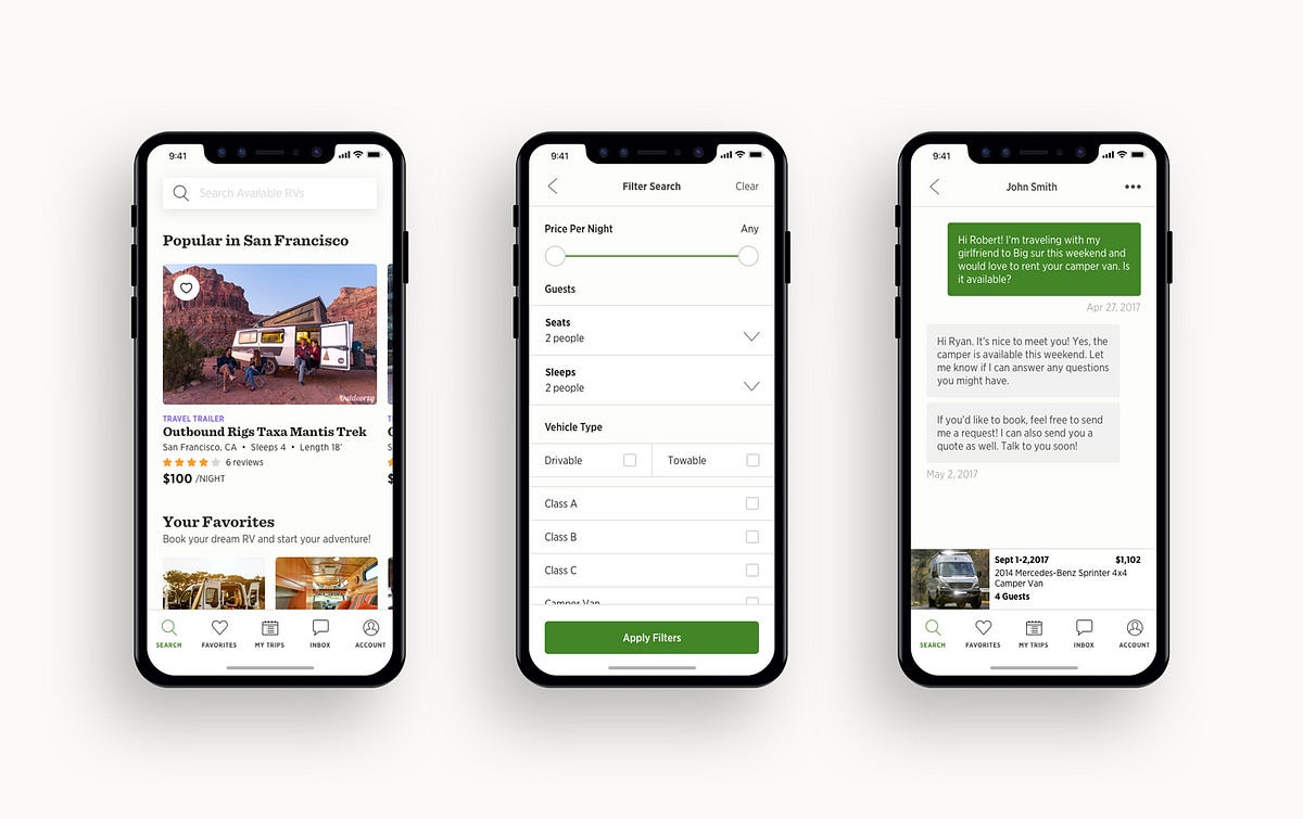
What is Outdoorsy?Outdoorsy is a leading peer-to-peer RV rental marketplace that gives RV owners the ability to safely rent out their RVs to potential renters. Outdoorsy differentiates its product offerings from competitors by focusing on user-centric design, trust & safety, and outstanding customer support.From the beginningAbout a year and a half ago I joined Outdoorsy as the first designer initially tasked with updating our flows, updating our visual design, and creating new user-centric mockups. The goal was to create higher converting flows and experiences that were easy to use for a wide variety of audiences. At this time, KPIs were not clearly defined, a process didn’t exist, and conversion funnels were loosely tracked on a regular cadence. I quickly had to work to define more clear goals and measurements of success.I collaborated directly with the development team to gain insights into whatever data was available and learn more about our various flows for all of our various audiences.The problemWe began focusing on the two major flows within our system. There was the owner flow (list your RV) and the renter flow (booking flow).Based purely on the numbers that we had gathered from Mixpanel, we found that we had a pretty decent conversion rate for users starting each flow but had significant drop-off rates as a user progressed through the flow.List your RV flow circa pre 2017Owner List Your RV FlowDrop off in the mobile experienceUnclear UX and error statesApplication messaging and communication on insurance and what to do next was lackingRenter Booking FlowIssues with delayed or no response after sending a booking requestUnintuitive mobile search and booking experienceInitial user research affirmed assumptions that the mobile experience was lacking due to the fact that mobile designs were never thought through.During this time, we also utilized data and findings from Inspectlet and Google Analytics to understand the highest priority issue for our users and the company.During this discovery process, we realized that a large majority of our users were interacting with our product via mobile. We also realized the importance of a mobile-focused approach to design.We decided we needed to create a mobile experience that allowed both a renter and owner to easily book or list an RV and for better communication.My roleI began working closely with the iOS developer and our Chief Product Officer to start building a product feature list and roadmap.After we created an initial product roadmap, I advocated to bring on another designer onto the team to help out with building out some of the flows.I soon became the lead product designer for the iOS mobile app and collaborated directly with the developer on the project.The ProcessPhase 1: Research & AnalysisI typically begin the process by gathering user data from available sources.This phase of the process is extremely important to make sure we understand our user’s needs and how that might apply to desired features and experiences. It was important for us to understand who we were solving a problem for and what were the problems we were solving for.Source 1: Inspectlet Session RecordingsWe run Inspectlet on our web platform that tracks user interactions. From there I’m able to see how a user interacts with our product and any potential issues. We have well over 35,000+ recorded sessions, so it was important to filter down to certain key funnels. It was a good starting point to begin forming assumptions.Source 2: Outdoorsy RV Owner Community Group on FacebookI also collaborated with our community manager to gather data and set up interviews with Outdoorsy RV owners via our Facebook Owners Group. Our Facebook owners group has over 2,300+ RV owners and users have been very active in this group. It allowed us to gather and create a working list of key issues owners were having with the Outdoorsy platform and start conversations to understand further.Source 3: Customer SuccessI also worked closely with our amazing customer success team who were on the phones and Intercom all day with our customers. We filed UX issues in a spreadsheet and identified potential candidates for an additional user research interview. This was extremely helpful in gaining some baseline assumptions and issues that might need more clarification or perspective.Source 4: Wheelbase Support & TrainingWheelbase is our pro software available to RV owners that allows them to easily manage their fleet. We have a small team that helps train RV dealers and owners how to use the product. It’s very high touch as all RV dealers get a personal training session. It was helpful to me to be a part of that process and talk to the Wheelbase team to speak with dealers and understand their major pain points.Source 5: User InterviewsWe selected participants from multiple channels and a variety of type of user to conduct user research interviews. We utilized Lookback.io to record all sessions. We chose to use Lookback.io so that we can remotely interview participants from different locations, have face-to-face communication, and record the interactions with the product.We wanted context around why users were doing the things they were doing. We asked questions like:Why are you listing your RV?Why are you booking a trip?Have you considered other travel plans?Tell me about the last time you booked a trip.What do you expect to see next?We wanted to ask and understand why someone is considering an RV in the first place, why they wanted to book or list their RV, and how someone might go about doing so.Issue TrackingI managed a small user research team of 2 to create and document all issues identified. We created a spreadsheet to document the source, the problem, and any other things to note to build context around a potential issue.User PersonasThere were 3 key sets of users that we wanted to account for: a typical renter, an RV owner, and an RV business owner. Within each category existed a wide range of characteristics.Creating these personas allowed me to think clearly about how might we serve both our existing users and future users.Internal Audit & Competitive ResearchAfter spending weeks of getting into the mindset of the user. I gathered screen captures of all parts of the flow and communication points of our web experience to get a basic framework to work from. I also collected all visual examples of everything we’ve created in the past couple of years, including the design system I created a couple months back.Checkout flow diagramPhase 2: Strategy and ScopeAfter I’ve had a chance to understand the marketplace, our user needs, and company objectives, we can move onto the strategy phase. It’s a good sign when initial research and exploration back up early assumptions and informs it with new information and perspectives.Setting the objectiveI met with the Chief Product Officer and two of the co-founders to set an objective for our first launch. First initial talks were high level, but soon became more granular and defined as to how success would be defined.From a company standpoint, we wanted to ensure 3 key things:It must be easy and simple for a renter to search, find and book an RV.It must be easy for an RV owner to list their RV.The app must allow for easier and faster communication between parties.Feature scoping and impactWe then needed to determine what features were important for our users. To help with this, I utilized a 2×2 matrix to visualize patterns and determine high impact features to both the user and for Outdoorsy.Creating the roadmapAfter determining the feature set for the application, I worked with the team to set an initial roadmap. Since the product was being built from scratch, it was important to make sure the bare essentials made it into the first pass. With each new release, we wanted to incorporate more benefits to each side of the market so that one side was not forgotten.Phase 1 — Essential functionality. Allow a renter to search, find a book and RV. Allow an owner to List an RV. Allow both parties to communicate.Phase 2 — Management & Reviews. Allow the owner to easily manage all aspects of their rental. Allow both renter and owner to leave a review.Phase 3 — Stories & Claims. Allow an owner to easily file a claim. Allow a renter to share memories from their trip.Phase 4 — On-going.Phase 3: Mockups & ExplorationWe knew what our users wanted, we knew what we wanted, and we had our roadmap. Now it was time to start exploring concepts and flows.A lot of time was spent around adjusting our current design system to account for native iOS.Taking a look at our card design, we wanted to push the boundaries by making cards fuller width.We also wanted to make sure inputs were larger and placement made sense for a mobile device.The iOS developer and I went back and forth on best practices and any missing parts. During this phase, I spent weeks building out various states, flows, and edge case wireframes to make sure we thought of the entire user journey.Phase 4: DesignI spent weeks applying our design system to use. I collaborated with another designer to make slight adjustments to interface elements to adhere to Apple’s Human Interface Guidelines. I experimented with various input types, expanding our card design to fuller width, experimented with depth vs flat, minimalism, and simplicity.I wanted to keep in mind an interface that would be clear, concise and easy to use for a wide age range and demographics.OutcomeThe original app was split into two separate applications (owner and renter) to allow the team to build more specific functionality to the end user.Outdoorsy Owner iOS AppShipped late 2018. 4.8 star rating (1.1k ratings)Outdoorsy Renter iOS AppShipped late 2018. 4.8 star rating (800 ratings)Originally published at www.ryanlum.com on May 16, 2018.Designing the Outdoorsy iOS App was originally published in Muzli - Design Inspiration on Medium, where people are continuing the conversation by highlighting and responding to this story.
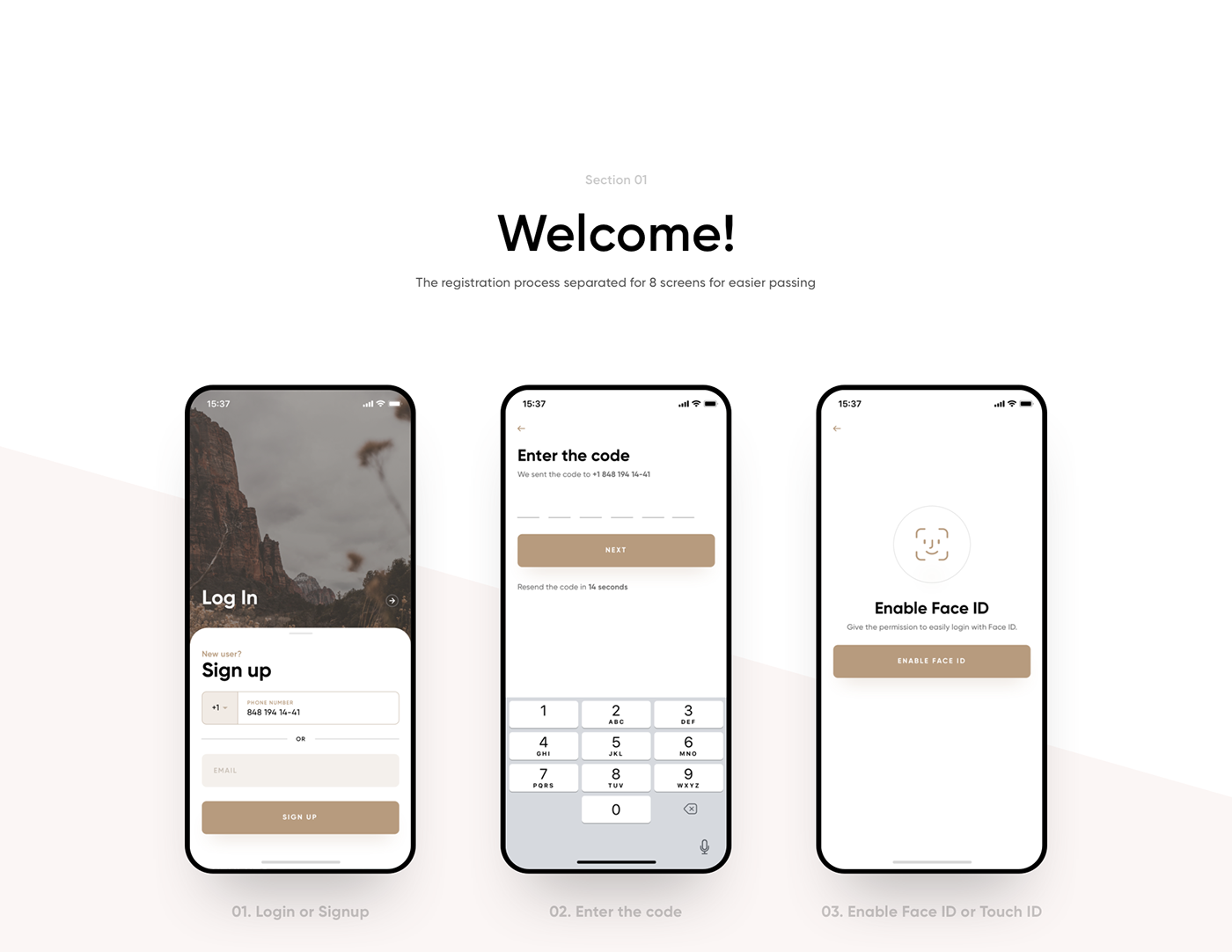
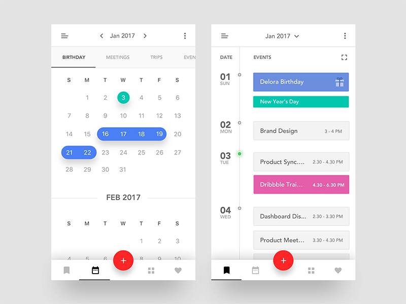


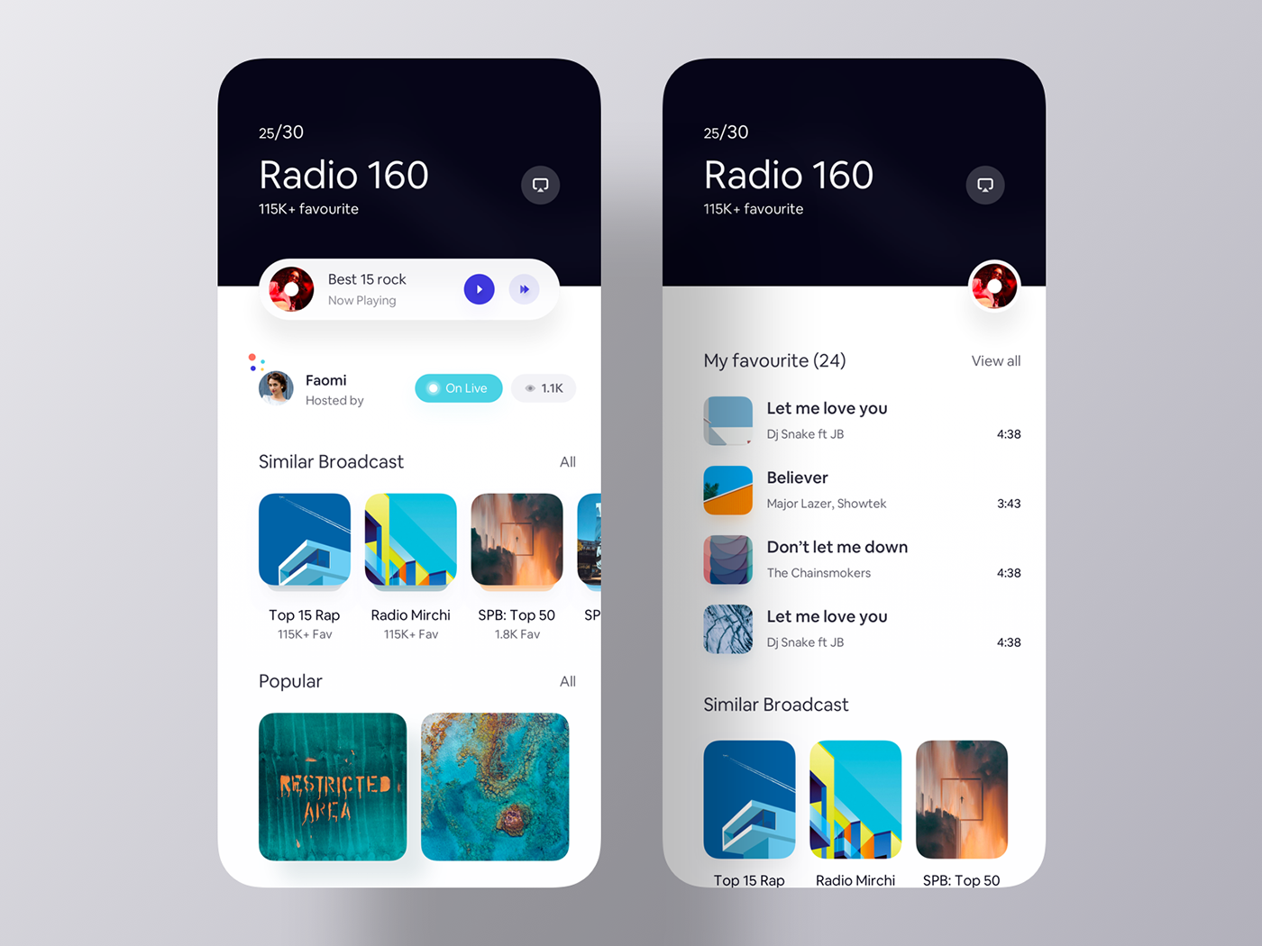
Collection of cool app ui from our recent Dribbble shots. All the r

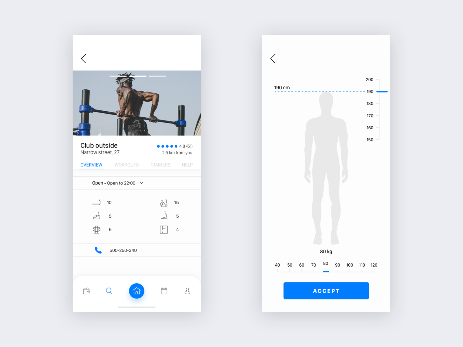
Hi, it's my gym iOS app concept. Any feedback will be appreciated. Comment and follow :) Press "L" to show some ❤
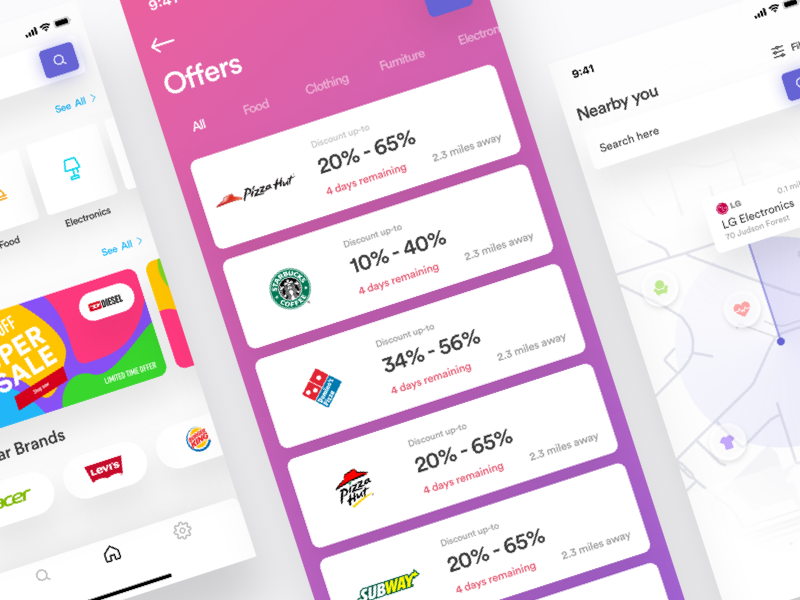
worked on Discount offering shop IOS app that allows to fine you shops that offering discount on products nearby you. hope, you'll like it! Don't forget to follow us. Instagram | Dribbble | Facebook | Behance We are available for the freelance project - luovastudio7@gmail.com :)
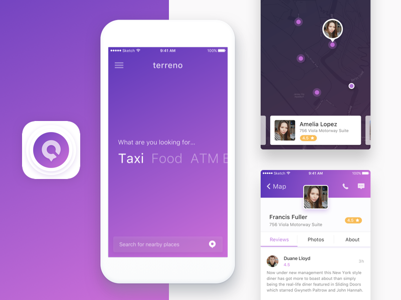
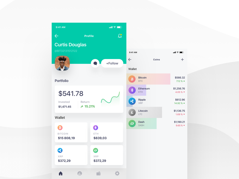
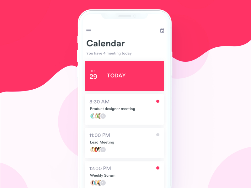
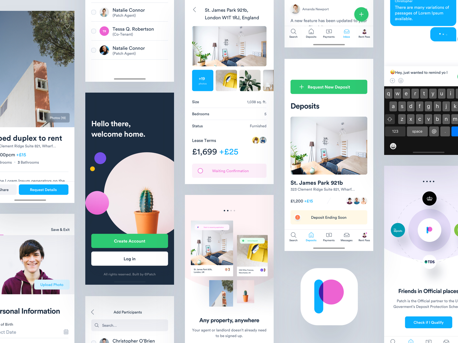

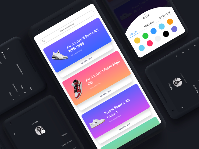
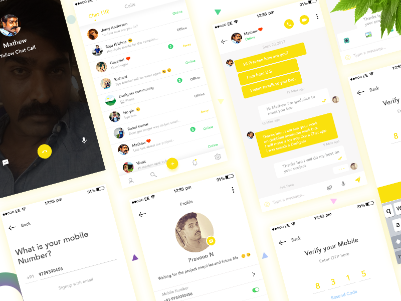
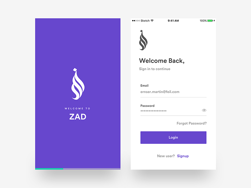
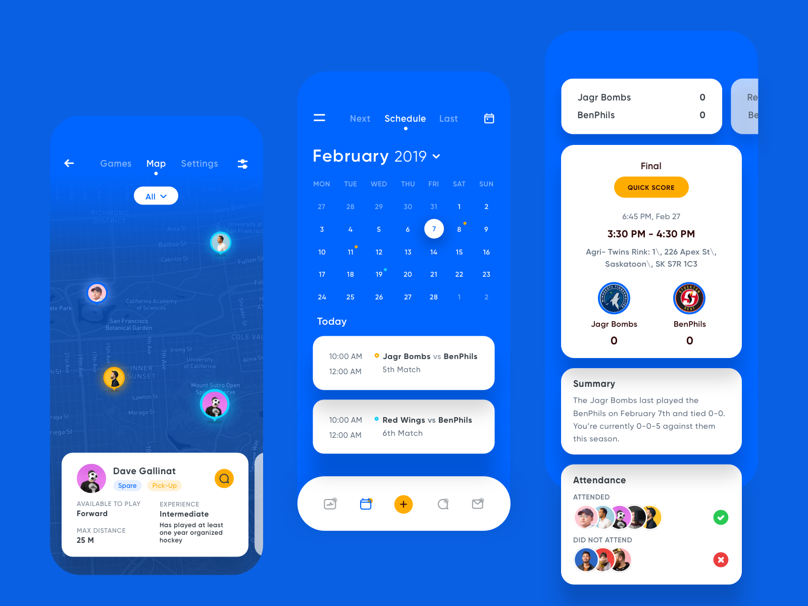
visual exploration for team management app Hope you all like it guys😊 ---------------------- Available for new projects to shoot your business inquiry: iftikhar.design@gmail.com Want to see more projects? Visit our profile and remember to follow us!
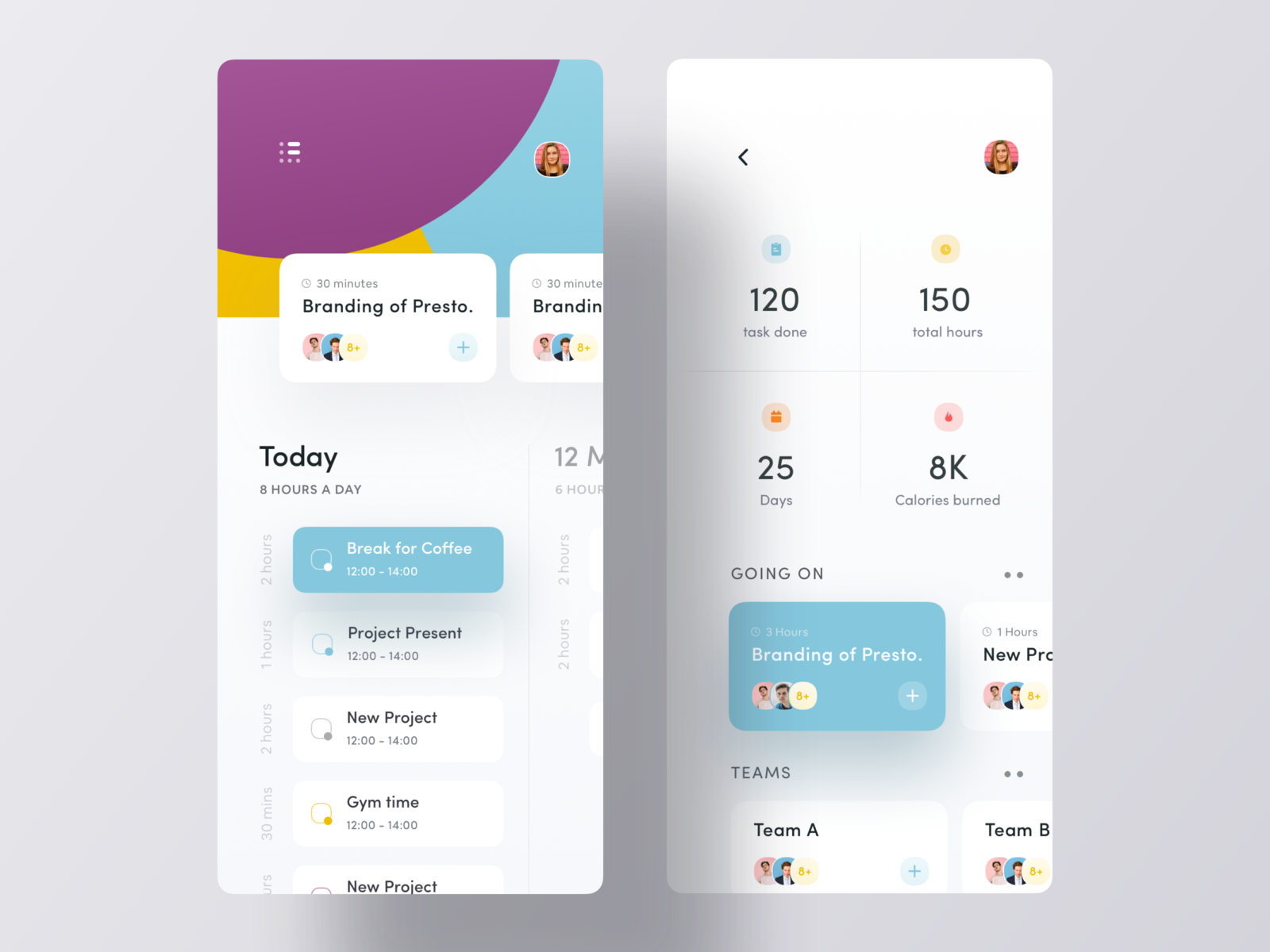
Task Management App UI *** 🔥Check Our Latest Project on Behance: https://www.behance.net/gallery/78751639/E-Sign-iOS-App-UIUX-Design *** 🔥Check our latest Case-study: https://medium.muz.li/ezy-resume-cv-builder-app-case-study-7a99c7c91724 ✉️Drop us a few lines at luovastudio7@gmail.com *** Or be a part of our community at: Instagram | Dribbble | Facebook | Behance
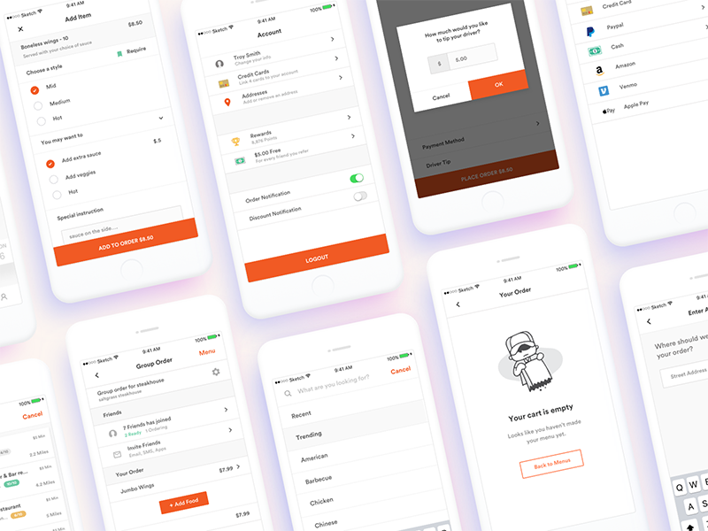

We analyzed popular applications and services that use the practice of Parking spaces, cars and other transport. On the basis of the collected data, an application was created that is aimed at the user's convenience to the maximum.
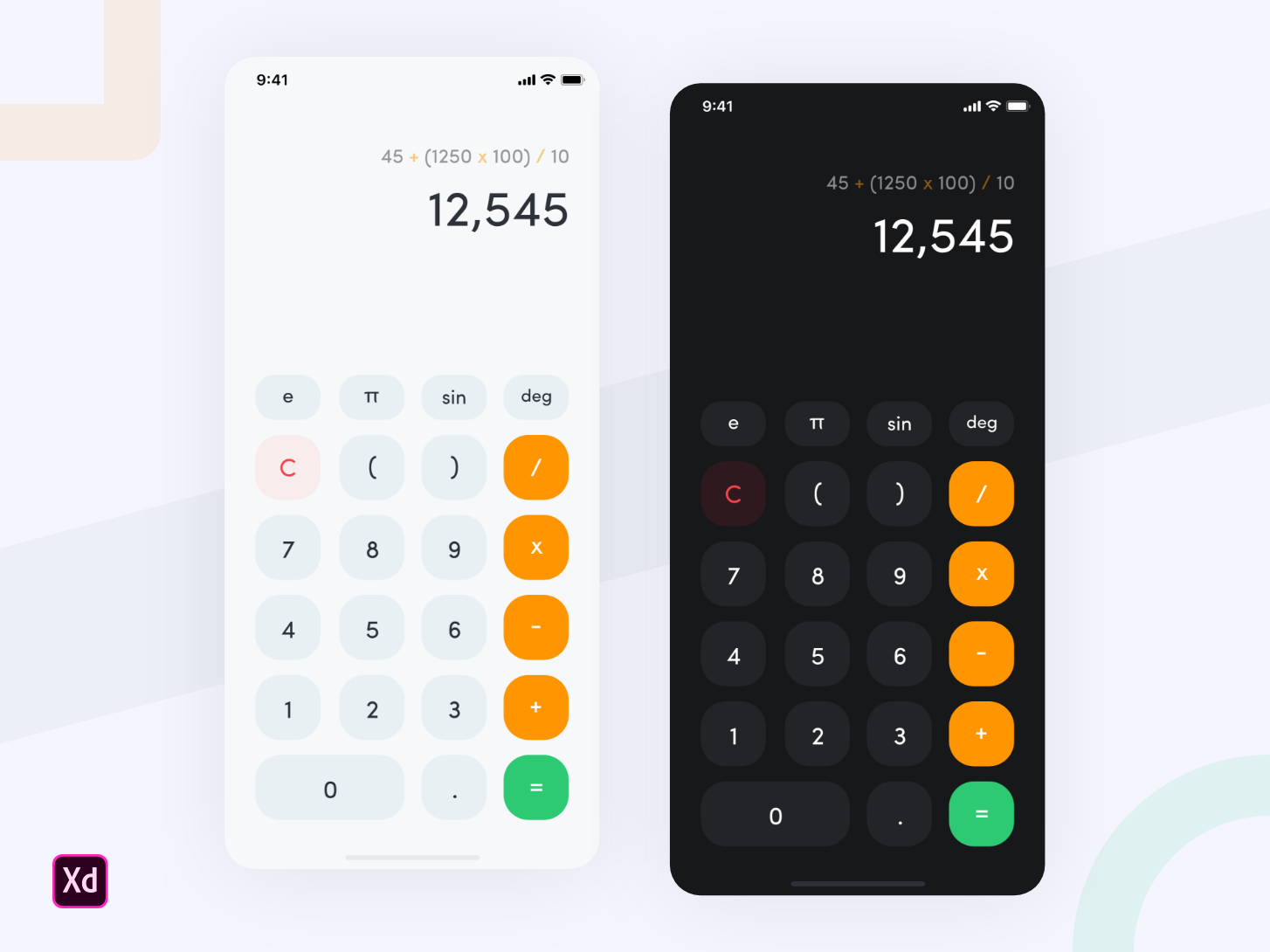
iOS 13 Calculator Concept 🔥 I tried to design a concept for iOS 13. Hope you like it. 😇 Let me know what do you think about it! 🙌🏻 Created in @[2254924:Adobe XD] #MadeWithAdobeXD 💜 Press "L" if you want. I will be grateful! Uplabs • Behance • Instagram • Twitter •
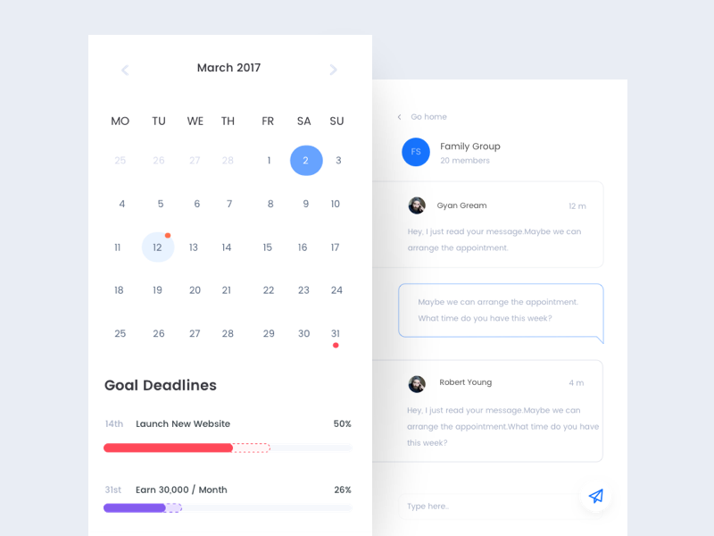
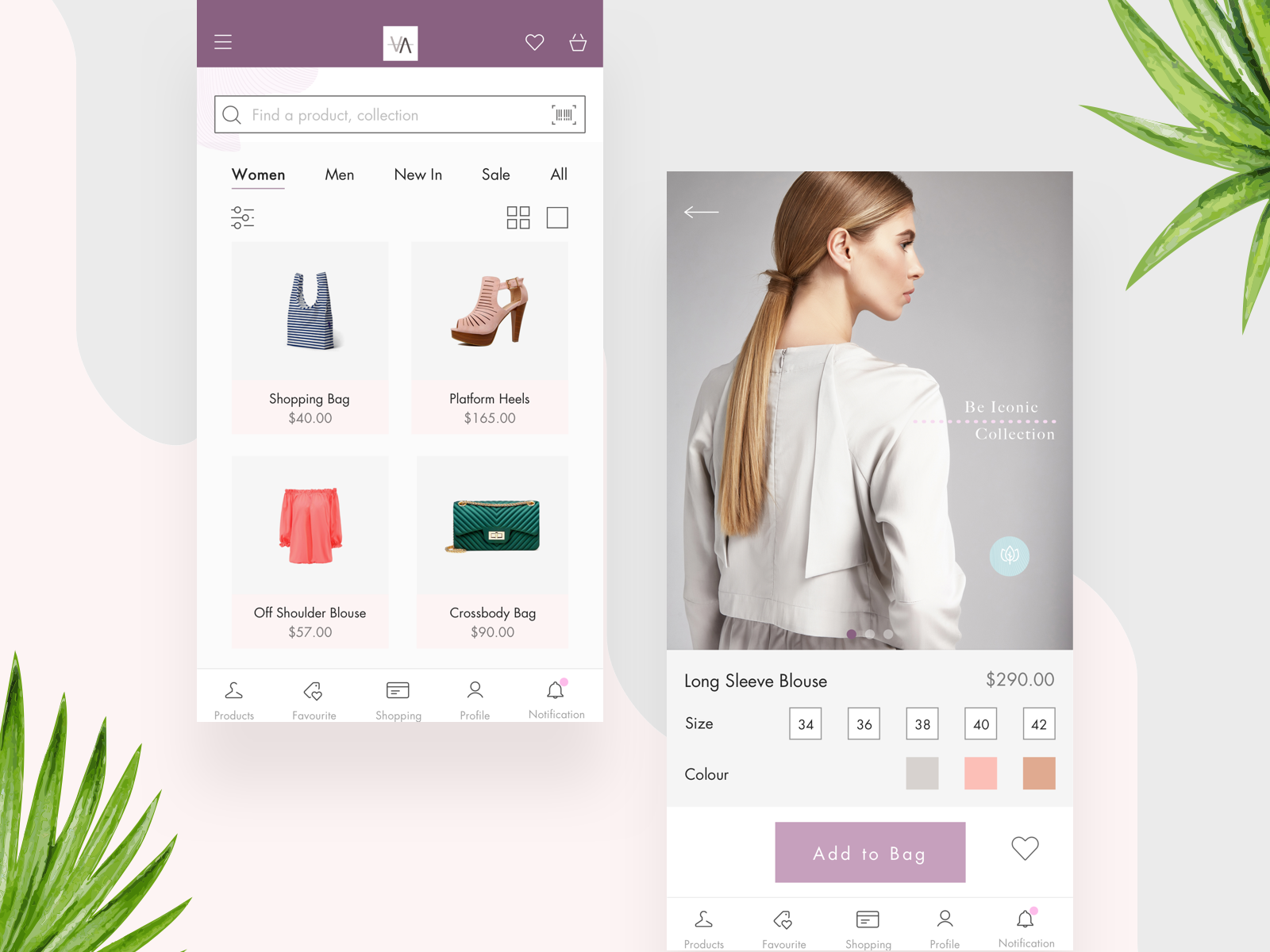
Hello! Today I'd like to share with you the concept of a fashion app for iOS. This is another stage of the "Be iconic" e-commerce project designed for a fashion boutique. Hope you like it! Don't forget to check out the attachments to see the real pixels.
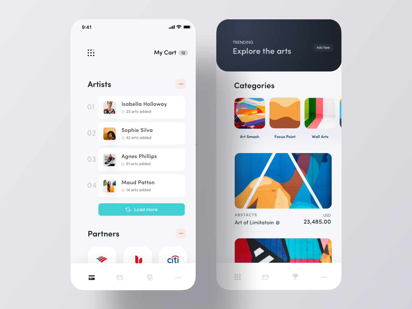
Art Exhibition iOS App Concept *** Luova Studio Small Design Studio focused on startup design solution, Feel free contact with us 🔥Check our latest Case-study: https://medium.muz.li/ezy-resume-cv-builder-app-case-study-7a99c7c91724 ✉️ We are available for the freelance project - luovastudio7@gmail.com ------------------------------------------------ Stay with us - Instagram | Dribbble | Facebook | Behance
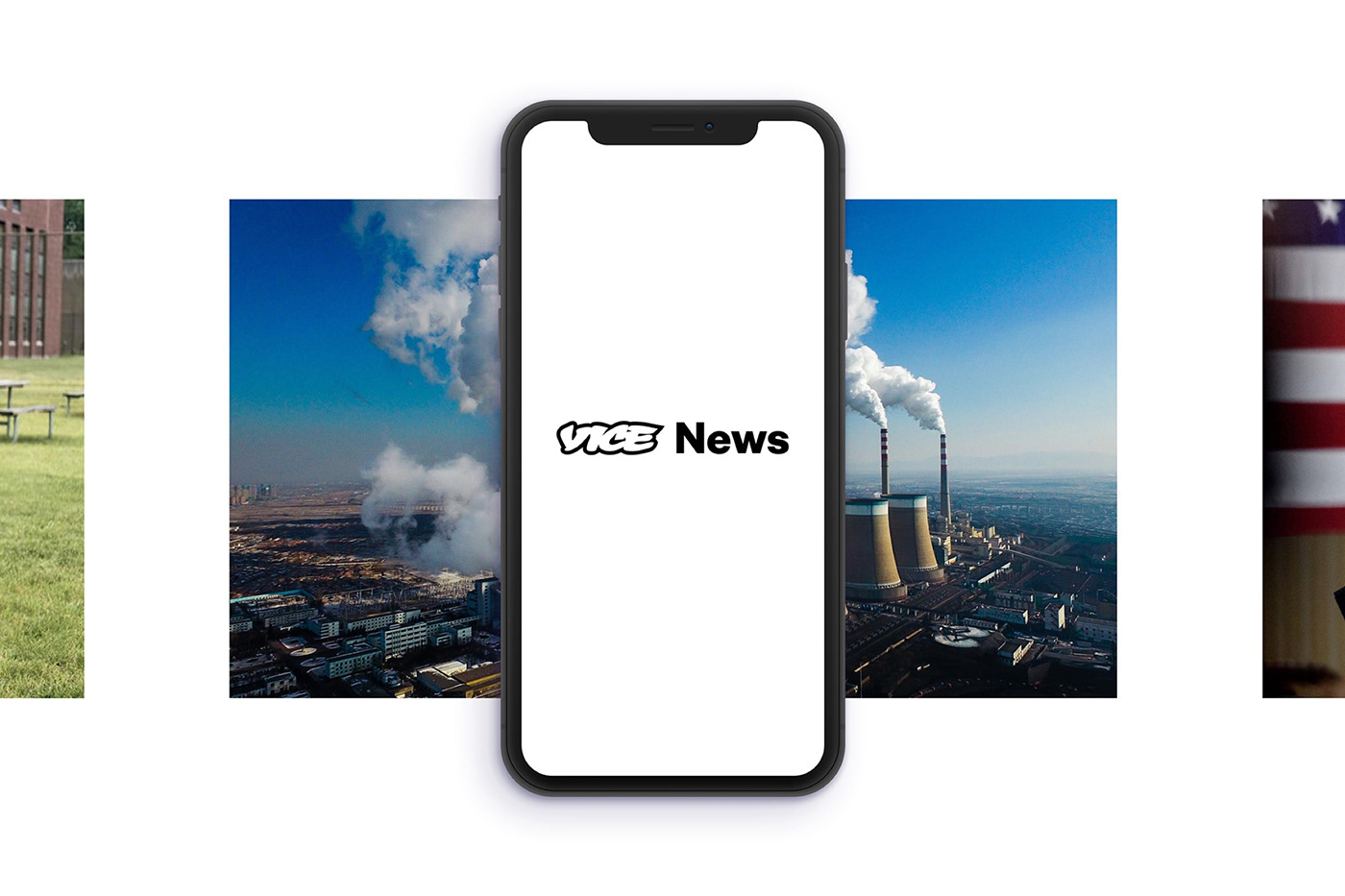
The Vice News Mobile App allows readers to stay up to date with everything that is happening in the world wherever they are. Vice News does away with the traditional news casting formula and present stories in new engaging formats. We wanted the mobile experience to be as immersive as the show no matter what device it is viewed on.


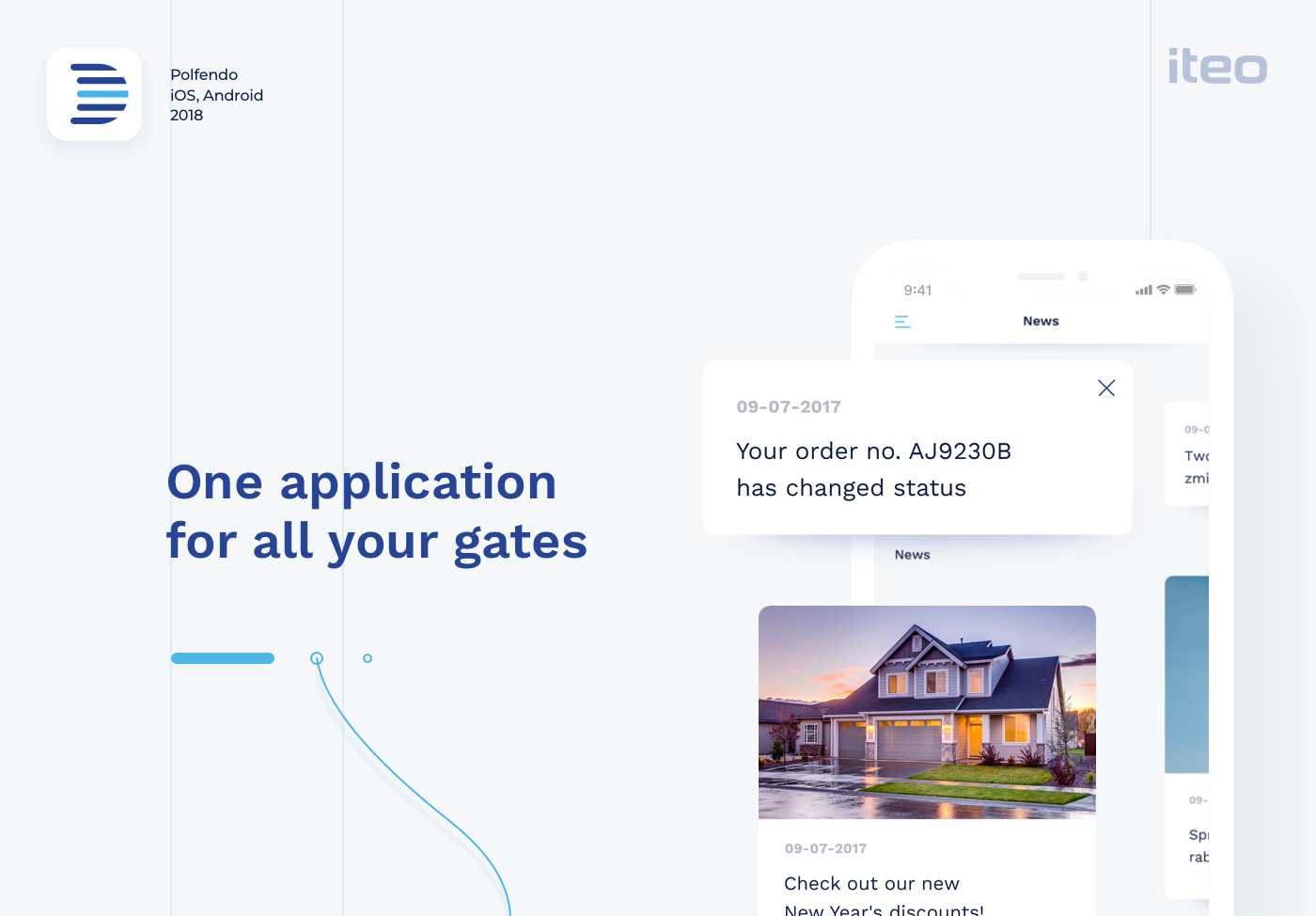
When we first engaged with Polfendo they were in the middle of a growth spurt and their product was evolving. We created customer personas for them that outlined each user’s buying triggers and buyer’s journey. Wireframes and prototypes were created, then tested with users in order to determine which of the approaches was the most functional, easy to understand and impactful to potential users. In this way, we were able to quickly validate or eliminate design approaches. Blue is the most relevant color in the business. It builds trust, feeling of loyalty, reliability, and responsibility. We also decided to use pure white color for more flexible handling of the application. Clean white & blue design puts the emphasis on depth of the application which is achieved by shadows and tiles. Simplicity allows the photographs to stand out against smooth typography. Just as door gates float above the ground, the UI floats above the application.
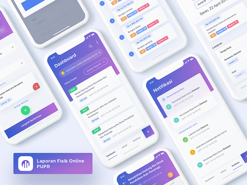
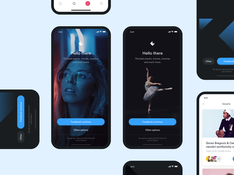
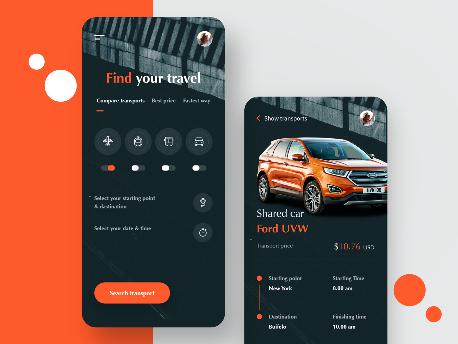
#Book Your Vehicle IOS App Share some love by pressing 'L' if you like this shot :) ---------------------------------------------------------------- Looking for UI app design? Learn more about our works here and contact us: getironsketch@gmail.com
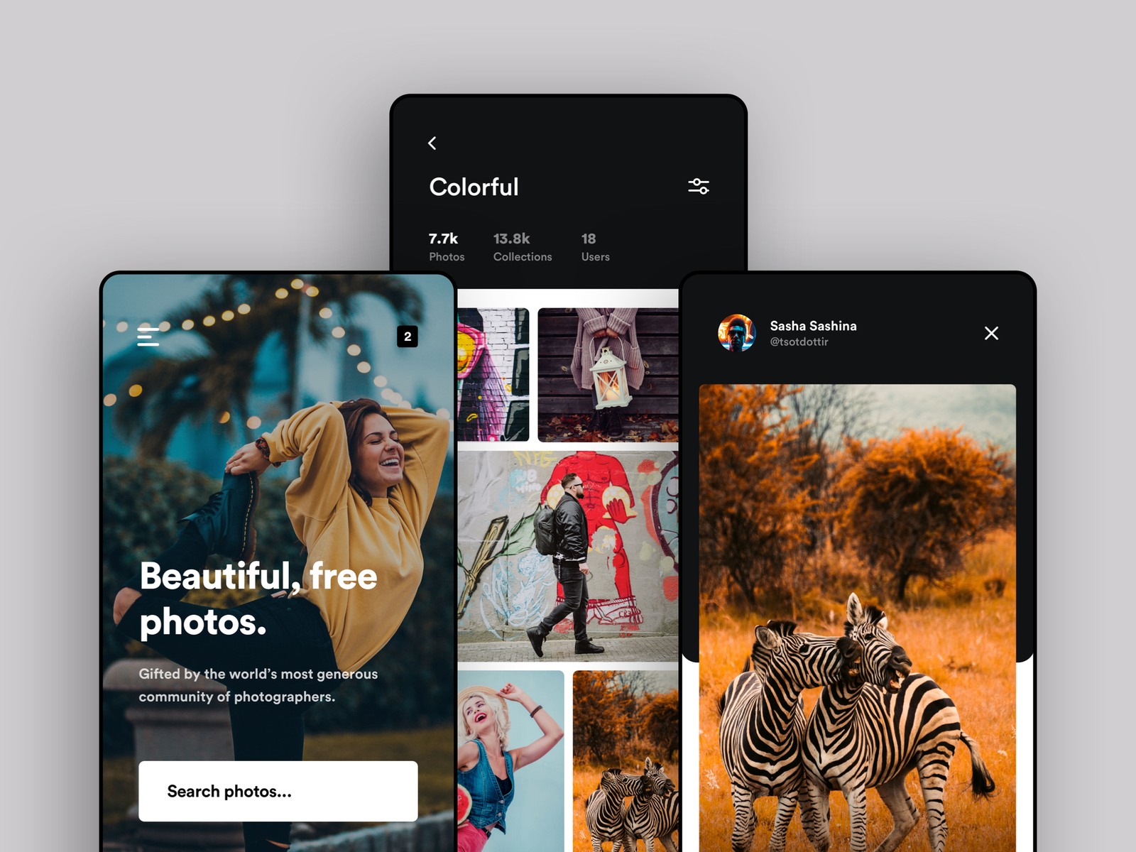
Although the hybrid app for Unsplash seems to be nicely designed and works well on most devices. I however believe a lil bit of animations & interactions can add a lot more fun and charm to all the beautiful pictures you see on Unsplash. You can check out some of the interactions on the rebound shot I have posted as well. Check Interaction & Animations here Follow me on Instagram - Linkedin
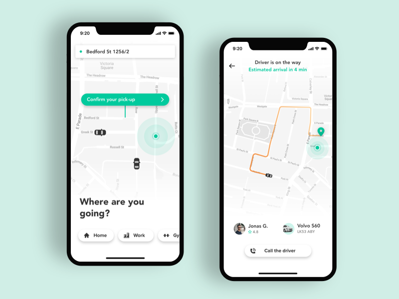
Concept of Taxi App I made for one of our client. Check attachment for details. Press "L" if you like my work.
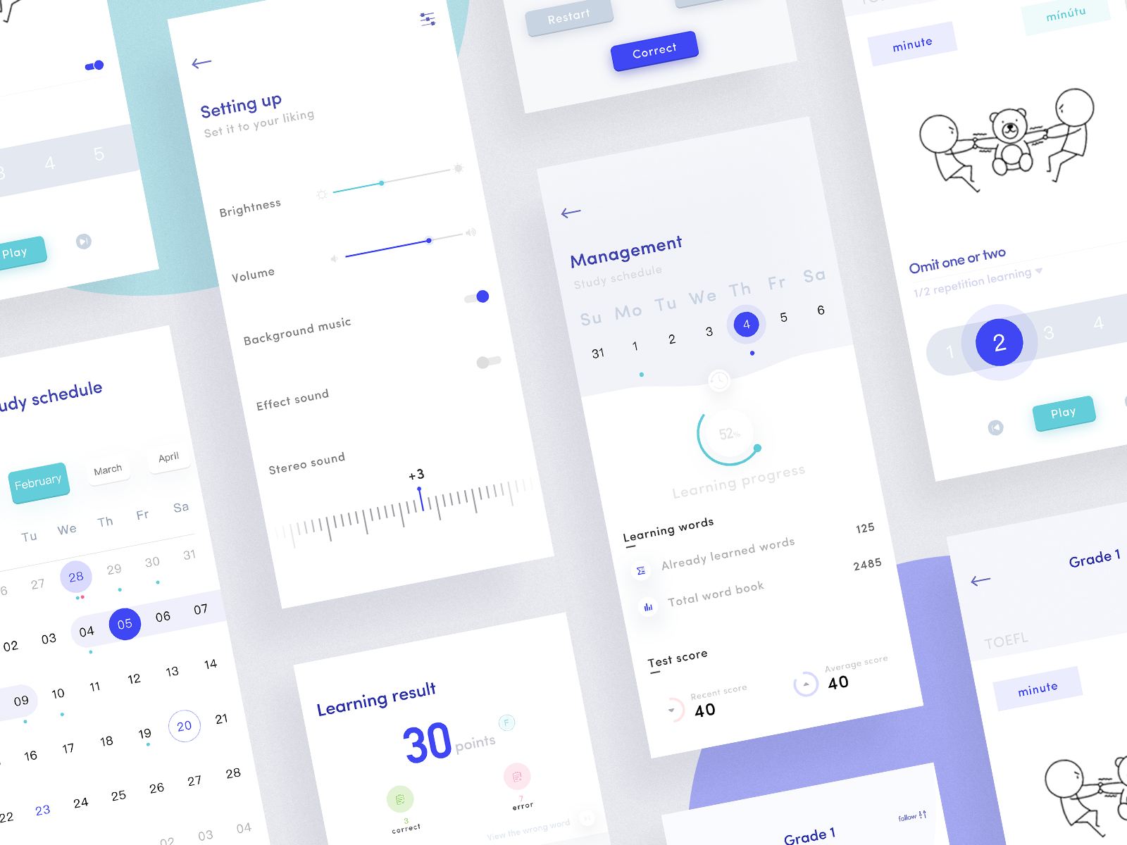
Hi guys, I am excited to share the app design I've been working on, today with you. I hope you'll enjoy it. - A piece from the project we have been working on recently. It helps users learn English or more in an easy way, creating a more relaxed learning environment. Isn't that cool? Soon you can find it on the AppStore Do you like it? Press "L".
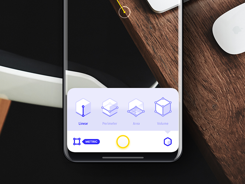
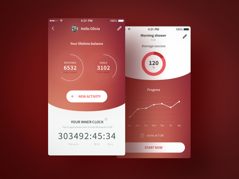
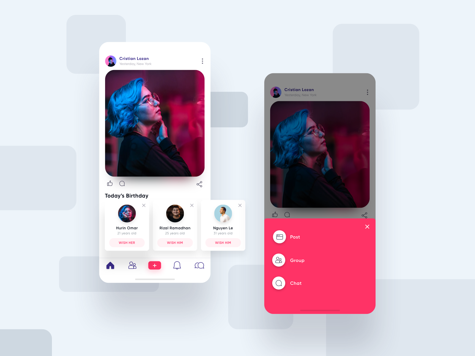
Hey friends 🖐 Working social app called agora more pixel share soon Hope you all like it guys😊 ===================== Available for new projects to shoot your business inquiry: iftikhar.design@gmail.com Want to see more projects? Visit our profile and remember to follow us!
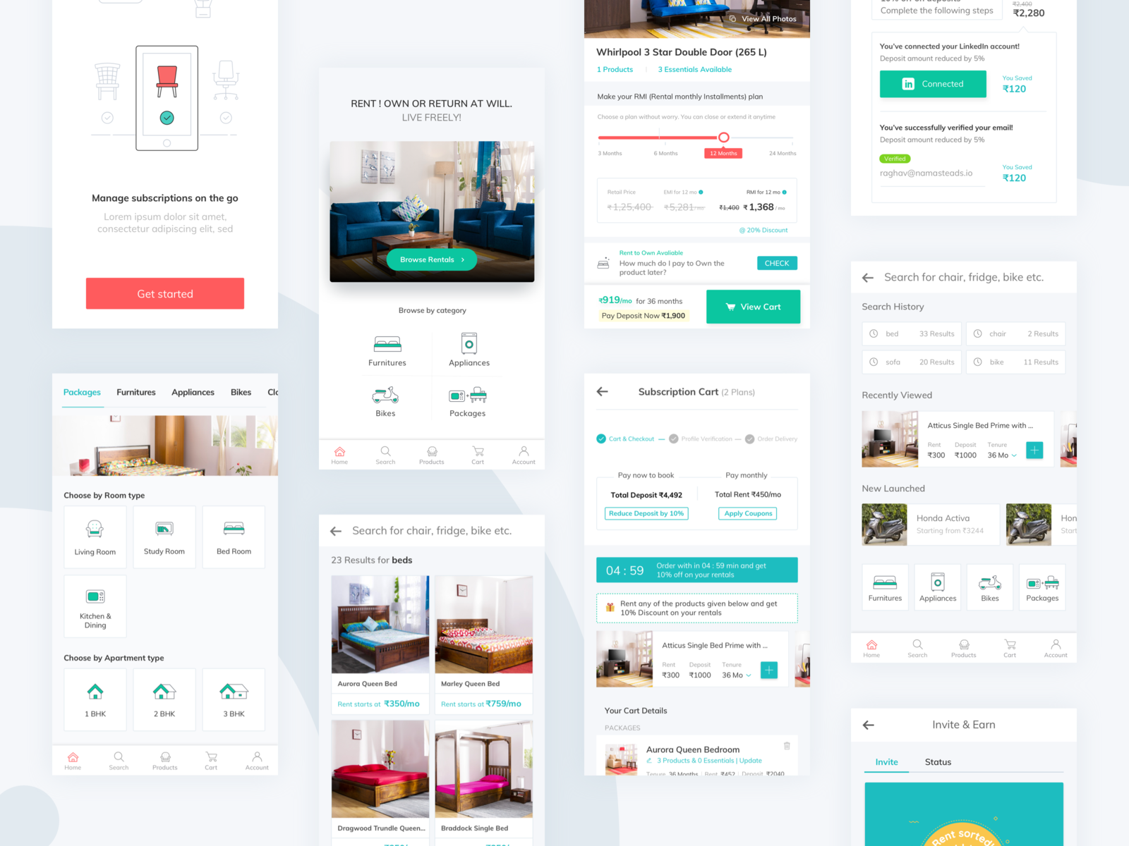
Hey Guys, Happy to say that finally, we have launched the iOS App for Rentomojo. Design team @[958121:Shreyash Barot] @hari @[1180563:Anoop Kumar 🎨] @[602333:ROHIT BIND]. Dev team @dvishu Would love to get your feedback. Please download the App and let us know the feedback. Download App Cheers! Shreyash Barot
Get access to thousands of freshly updated design inspiration pieces by adding Muzli to your browser.
Loved by 750K designers worldwide, Muzli is the leading go-to browser extension for creative professionals.
Designing an iOS app is a thrilling creative adventure where aesthetics meets functionality. In today's rapidly evolving mobile app landscape, crafting an iOS app that's both visually captivating and user-friendly is essential for making a mark in the App Store and providing users with an unforgettable experience. In this article, we'll delve into the key considerations for designers when working on iOS app projects.
User-Centric Design
Start your iOS app design journey by putting users at the heart of everything. Dive into user research, create user personas, and actively seek feedback to ensure your app aligns with the needs and expectations of your target audience.
iOS Design Guidelines
Apple's Human Interface Guidelines (HIG) are your holy grail for iOS app design. These guidelines offer a solid framework for creating apps that harmonize with Apple's design philosophy. Staying faithful to HIG guarantees your app's consistency within the iOS ecosystem, helping it feel right at home on the platform.
Responsive Design
iOS apps need to adapt gracefully to various screen sizes and orientations, from the smallest iPhone SE to the largest iPad Pro. Prioritize responsive design principles and leverage tools like Auto Layout to maintain a seamless look and feel across devices.
Intuitive Navigation
Simplicity is key when it comes to navigation within an iOS app. Establish a clear hierarchy and rely on conventional navigation patterns, such as tab bars, navigation bars, and intuitive gestures like swiping. Make sure users can move through your app effortlessly and without any guesswork.
Typography and Readability
Typography plays a vital role in your iOS app's design. Choose legible fonts and maintain a well-considered hierarchy of text sizes to guide users through your content. Pay close attention to factors like line spacing, contrast, and color choices to enhance readability.
Visual Consistency
Consistency is the secret sauce for a polished iOS app. Stick to a coherent color scheme, typography, and iconography throughout your app. Consistency not only boosts visual appeal but also aids users in navigation and comprehension.
Icon Design
Icons are the unsung heroes of iOS app design, conveying actions, features, and content. Invest effort into designing icons that are visually appealing, easily recognizable, and compliant with Apple's guidelines. Consider vector-based icons for a sharp look across various screen sizes.
Accessibility
Make your iOS app accessible to all users, including those with disabilities. Utilize dynamic type for scalable text, provide alternative text for images, and ensure compatibility with VoiceOver for a seamless experience for everyone.
Performance and Speed
A responsive and swift iOS app keeps users engaged. Prioritize performance by optimizing images and animations, minimizing unnecessary network requests, and implementing lazy loading to improve loading times. A slow app can lead to user frustration and abandonment.
User Testing and Iteration
User testing is gold. Collect feedback from real users regularly and use it to refine your design continuously. This iterative approach ensures a continually improving user experience, addressing any usability issues as they arise.
Designing an iOS app is a creative journey that marries form and function. Embrace user-centric design, adhere to iOS design principles, and pay attention to critical elements like navigation, typography, and performance to create an exceptional iOS app that resonates with users and stands out in the competitive app market. Remember that the journey doesn't stop with the app's launch—it's an ongoing process of refinement and improvement to keep your users engaged and satisfied.